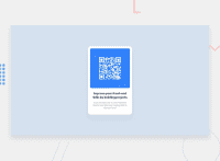
Design comparison
Solution retrospective
Hello, I'm Brazilian, and this is the first project that I do and share, everything is still new to me, I hope I can count on the help of the community and that they can help me grow even more in this journey as a developer in development.
Community feedback
- @0xabdulkhaliqPosted over 1 year ago
Hello there 👋. Congratulations on successfully completing the challenge! 🎉
- I have other recommendations regarding your code that I believe will be of great interest to you.
CSS 🎨:
- Looks like the component has not been centered properly. So let me explain, How you can easily center the component without using
marginorpadding.
- We don't need to use
marginandpaddingto center the component both horizontally & vertically. Because usingmarginorpaddingwill not dynamical centers our component at all states
- To properly center the component in the page, you should use
FlexboxorGridlayout. You can read more about centering in CSS here 📚.
- For this demonstration we use css
Gridto center the component
body { min-height: 100vh; display: grid; place-items: center; }- Now remove these styles, after removing you can able to see the changes
.container {
  padding: 120px;
}
- Now your component has been properly centered
. BODY MEASUREMENTS 📐:
- The
width: 100%property forbodyelement is not necessary. becausebodyis a block level element which will take the full width of the page by default.
- So feel free to remove
width: 100%style rule frombody
.
I hope you find this helpful 😄 Above all, the solution you submitted is great !
Happy coding!
Marked as helpful0 - @Bader-IdrisPosted over 1 year ago
You can set the container in the middle of the screen whatever user changes it when you add these properties to it in CSS:
.container {
  display: absolute;
  top:50%;
  left: 50%;
  transform: translate(-50%, -50%);
}
the new feature is transform, it has many lovely properties you can discover, I personally love it. Hope it's useful
0@LandielDuransPosted over 1 year ago@Bader-Idris Thanks for the tip my friend, it was of great help for my future codes.
0 - @lepamoorePosted over 1 year ago
Hey Landiel 👋, Your code looks very nice ! Much better than my first project here, lmao. I just read it and want to give you some feedback.
-
First, for body HTML and DIV tags, you don't need to specify the width to 100%. For these elements, the width is automatically set to 100%.
-
Then I recommend using the units % or vw (view-width) and vh (view-height) for width and height of a div or a similar element. When you use the % unit, e.g. width: 50%; Your element will be as half as big as the parent element because the % unit takes the height or width value of the parent as 100%. When you use width: 50vw; it's the 50% of the viewpoint width or device width. Same for height: 50vh; it's 50% of the viewpoint width or device width.
-
When you use these relative units, your elements will grow and shrink as the browser does. You can set maximum or minimum values in px. you could use this CSS rule as an example:
div {height: 50vh; min-height: 200px;}in this case, your div container is half as big as the height of the browser window, but it won't get smaller than 200px. That means, even if your browser window is 300px high, your div will remain 200px high. -
I saw you used some flexbox to center your divs. That was pretty nice, i just noticed you only used justify-content with flexbox. justify-content is as you know for the horizontal alignment. And if you use align-items: center; as well, your element will be fully centered.
<div id='parentDiv'>
  <div id='childDiv'></div>
</div>
#parentDiv { display: flex; align-items: center; justify-content: center; background-color: blue; } #childDiv { height: 50%; width: 50%; background-color: white; }-
above you can see the code for a fully centered div in another one. Feel free to copy it and run it in the browser to get a better understanding of what I mean. My English isn't the best, so I hope you can understand what I mean 😅.
-
another important thing is use for further description of an image, an alt attribute. don't use title='this image shows a chair'. Use alt='this image shows a chair'. This way people who are using the internet with screen readers can hear your pictures then instead of seeing them.
-
keep it up. I'm just new to coding like you, but I hope my hints or tips were helpful to you. Greetings and Happy coding! 😉
0@LandielDuransPosted over 1 year ago@lepamoore Thank you very much for your feedback, it is very important to help my growth. Thanks for the tips and good coding to you too.
0 -
Please log in to post a comment
Log in with GitHubJoin our Discord community
Join thousands of Frontend Mentor community members taking the challenges, sharing resources, helping each other, and chatting about all things front-end!
Join our Discord

