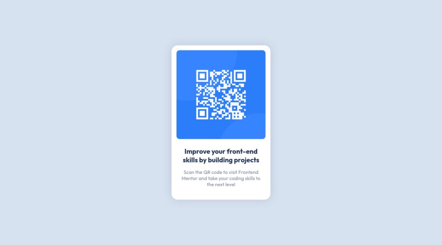
Design comparison
Solution retrospective
Due to the fact that this is my first project, my biggest problem with it was aligning everything vertically. I came up with a solution but I have no idea if it is an elegant one. I have a lot of work ahead of me.
Community feedback
- @OGShawnLeePosted almost 3 years ago
Hello, good one! Some feedback right here.
- You should have wrapped your content inside of a main tag.
- About the alignment you could have aligned it with flexbox like this:
body { min-height: 100vh; display: flex; align-items: center; justify-content: center; }-
For transparent colors I recommend using rgba because it is easy to know how transparent a color is by looking at the last number. Like rgba(0, 0, 0, 0.25).
-
Use CSS variables. They come in handy when you need to change something. Update once and everything changes nicely.
This is a pretty simple project and you did a great job. Hope this helps and you keep coming back with new solutions! Have a good one :)
Marked as helpful1P@ArthurPogPosted almost 3 years ago@OGShawnLee Thanks for the feedback Shawn!
-
Thank you for the heads up on this one. I had no idea such things as ARIA landmark roles even existed. I just read up on them and changed my main div to role="main". I also checked Frontend Mentor's HTML and couldn't find a role="main" div anywhere. Though there are role="status" and role="img" used but no "main".
-
When I align my content with a flex box, I get a weird glitch where a vertical scrollbar appears in my Firefox browser regardless of the fact whether the content fits or not. But when I use my solution, I get no glitches.
-
Converted the box-shadow transparency to RGB for better readability.
-
CSS Variables - I had no idea this was a thing! :) The possibilities!
Thank you ever so much for this feedback. My mind is thoroughly blown. I'm gonna go start another project and put all this new knowledge to use.
1P@ArthurPogPosted almost 3 years ago@OGShawnLee Alright, well, it seems my solution wasn't as glitch-less as I thought. After fixing all of my projects with a really ugly conditional CSS solution I went back and dug deep into what you wrote in your second point and it worked. I have no idea what I did the first time to get the glitch I was describing. So 3 projects later and hours of "What am I doing wrong?!", I came back to what you said in your post full circle.
So thank you once again for your help my good man!
1@OGShawnLeePosted almost 3 years ago@ArthurPog Hey! You figured it out that's great!
CSS can be a nightmare sometimes. Once you are comfortable with it, I recommend checking out a framework like Tailwind or Windi. They are really good!
I am happy my feedback was useful mate. Best wishes!
Marked as helpful1P@ArthurPogPosted almost 3 years ago@OGShawnLee Holy moly! You're a gem! Just checked out Tailwind and Windi. They look sick! Thanks for the suggestions, mate. Now I've got more things to look forward to.
1
Please log in to post a comment
Log in with GitHubJoin our Discord community
Join thousands of Frontend Mentor community members taking the challenges, sharing resources, helping each other, and chatting about all things front-end!
Join our Discord
