Design comparison
Community feedback
- @nodegreecodePosted about 1 month ago
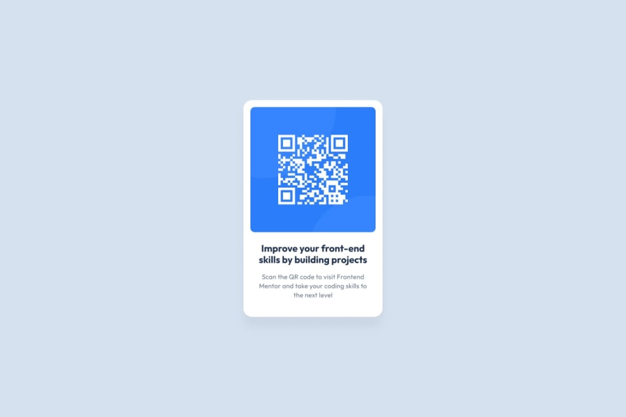
HTML is valid and built semantically correct. The description of the image could be a bit longer and preciser. Something like "illustration of white qr code on the blue background". The layout looks good while changing screen size, but however the content inside is not fluid. You could try using "max-width" instead of "width" when defining the size of the container. Not so much reason to select paragraphs like this ".text > .text-second" if they have their own unique classes. There are some improvements regarding the class names, so basically, to make it reusable and meaningful, you should better use some general names, which describe the element hierarchically or in the case of some heading/title according to their function. A heading or title can be reused over the entire project. Instead of "text-first" you can write "card-title" or "qr-code-title". The solution generally looks very close to the design. Great job!
Marked as helpful0 - @Fable54321Posted about 1 month ago
Good job, did better than me at finding the right font-weights. Centering perfectly vertically is a bit of a waste of time for such a simple project, a completly different job than centering horizontally.
Only thing is, you could have use better html tags for a more semantic approach.
Marked as helpful0
Please log in to post a comment
Log in with GitHubJoin our Discord community
Join thousands of Frontend Mentor community members taking the challenges, sharing resources, helping each other, and chatting about all things front-end!
Join our Discord
