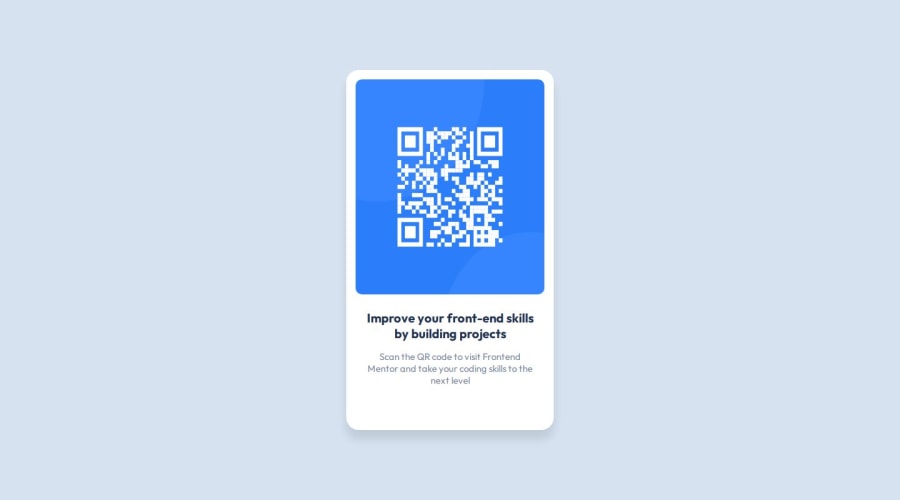
Design comparison
Solution retrospective
I was able to use Flexbox with ease and was happy with it but would try to use Grid next time.
What challenges did you encounter, and how did you overcome them?It was troublesome to make the mobile design had to go through media queries again to make it barely ok.
What specific areas of your project would you like help with?I would like to know what's the approach to make mobile design and help with the sizing in the same.
Community feedback
- @danielmrz-devPosted 4 months ago
Hello @Y-ashbhatt!
Your solution looks excellent!
I have just one suggestion:
📌 Avoid setting fixed
width
values for elements like this. You've setwidth: 23%
for the card and this is making it shrink as you reduce the window width. Instead, you can set amax-width
to it.And about height, you don't need to set height to the card, because it adapts automatically as you add content to it.
Here's your code with the suggestions:
.box { /* width: 23%; remove this line ❌ */ /* height: 72%; remove this line ❌ */ /* max-width: 350px; add this line ✅ */ border-radius: 20px; background-color: var(--White); text-align: center; box-shadow: 0 15px 15px rgba(0, 0, 0, 0.1); padding: 15px; }
I hope it helps!
Marked as helpful2 - @defPhisyPosted 4 months ago
Hi, first of all I want to gratualtion you for doing this challenge, even if it's the first one, at least for me. This is my first review and i am not an experienced developer but i try to give you some good feedback related to my actual knowledge:
- html looks good from my side, but i would omit the
div .container
as you use it on the whole page with100 vw/vh
. Just move the styles to body:
body { background-color: var(--Light-gray); font-family: var(--main-font); width: 100vw; height: 100vh; display: flex; justify-content: center; align-items: center; }
-
i would´ve been more descriptive with the class names. For example, instead of
class="box"
you could use for exampleclass="qrCodeCard"
. I think if you are working on bigger projects you may have many elements like "box" and you want to style them differently. That might be difficult if you just name it box. -
I think in this challenge it is not necessary to make a separate mobile version since the size of this qr code is very small. for mobile your mediaquery is at 480px and the qr code has a width of 320px.
-
what you should fix: width and height are declared with different percentages. You should use fix values in this case. The card has clear measures. Your styles deform the img.
@media (max-width: 480px) { .box { width: 55%; height: 70%;
.box { width: 23%; height: 72%;
img { display: block; height: 63%; width: 100%;
Hope i could help you. Keep up the great work.
Marked as helpful1@Y-ashbhattPosted 4 months ago@defPhisy Thank you for your advise. I was thinking using percentages is kinda wrong here. If you can please tell me how should i go about getting the values, is it through the figma design files? But they not available for all projects so is it by instinct?
0@defPhisyPosted 4 months ago@Y-ashbhatt To be honest, I used the figma file. Without i think you just have to estimate it? Not sure either. but the advise from @danielmrz-dev with max width is a better solution than mine. I´ll try it on the next challange.
1 - html looks good from my side, but i would omit the
Please log in to post a comment
Log in with GitHubJoin our Discord community
Join thousands of Frontend Mentor community members taking the challenges, sharing resources, helping each other, and chatting about all things front-end!
Join our Discord