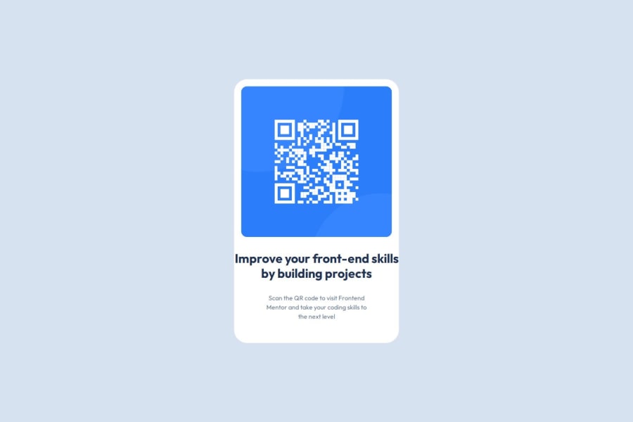
Design comparison
Solution retrospective
I am most proud that it didn't take me long to complete the project and I was able to do it without any help. I also learned about using new tools such as Figma. It gave me a chance to understand more about design files.
What challenges did you encounter, and how did you overcome them?I wasn't sure about the font-sizes to use. I had to guess on the font-size for the h1 element.
What specific areas of your project would you like help with?not sure when I should ever use px.
Community feedback
- @Joshtemi0Posted 3 months ago
Great job
Not a problem using
px
. It is just that you will have to be using higher number in settingpx
. So for me I do userem
and it is easy to calculateHope this is helpful.
Marked as helpful0@geomydasPosted 3 months ago@Joshtemi0 you are wrong about the rem and px part. rem is relative the user font-size (it can be change in the settings) and px isn't.
you often use rem if you want to scale it with the font-size and you will only ever use px on very small things such as border, border-radius, outline, shadows + if you dont want it to scale with the set user font size. here's an article for some of the exceptions
Marked as helpful1@Joshtemi0Posted 3 months ago@geomydas
Thank you
Just saying for example trying to set a height of
10rem
. If usingpx
you will have to use100px
. So just suggesting to userem
in this case. Just to avoid large numbers.Or that do you think ??
0@VincinChristmasPosted 3 months agoI notice that my solution is bigger and looks just a tad bit different from the real picture here. Does it need to match exactly? Should I go back and make changes? @geomydas
0@geomydasPosted 3 months ago@Joshtemi0 quite different, look at what i said earlier. you shouldn't just use rem because it makes it easier for larger numbers. also you are wrong about the conversion: 1 rem = 16px (depends on the users setting but this is the default);
0@geomydasPosted 3 months ago@VincinChristmas its okay if the some of the margins, spacings are off. there's no need to make it "pixel perfect". in the real world, achiving pixel perfect is almost impossible to deadlines and other things. if you can make it pixel perfect, thats okay. if not, thats also okay
Marked as helpful0@Joshtemi0Posted 3 months ago@geomydas Yeah. Forgot it's 16px.
Also the guy is asking you a question
Marked as helpful0@geomydasPosted 3 months ago@Joshtemi0 I already responded to his other question, no worries
0
Please log in to post a comment
Log in with GitHubJoin our Discord community
Join thousands of Frontend Mentor community members taking the challenges, sharing resources, helping each other, and chatting about all things front-end!
Join our Discord