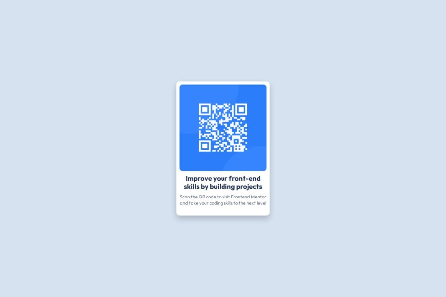
Design comparison
Solution retrospective
I am very proud of how I managed to solve the problem of arranging the items on the card. Initially, the elements were exiting the container, but I was able to identify the cause and make adjustments to the image size and CSS structure so that everything was aligned and inside the div. I am proud to have found a quick and effective solution that improved the visual presentation of the page. Next time, I would spend more time planning the structure and design from the beginning. In this project, I started writing the code quickly without thinking too much about how the items would be distributed within the card. If I had spent more time planning it, I think I would have avoided some problems from the beginning. In future projects, I will make sure to better analyze the design before starting the code to avoid possible unnecessary adjustments later.
What challenges did you encounter, and how did you overcome them?To fix this, I researched and adjusted the CSS properties of the items inside the card. I found that the image size of the QR code was too large for the container, so I modified its dimensions to better fit the available space. I also allowed the card to adjust its height dynamically depending on the content. These small changes helped make the design more flexible and responsive, ensuring that all items were kept inside the div without leaving the container.
What specific areas of your project would you like help with?i would like help with adjuste the CSS properties of the items inside the card.
Community feedback
Please log in to post a comment
Log in with GitHubJoin our Discord community
Join thousands of Frontend Mentor community members taking the challenges, sharing resources, helping each other, and chatting about all things front-end!
Join our Discord
