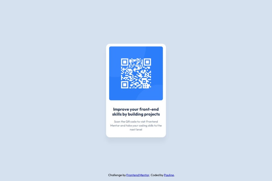
Design comparison
Community feedback
- @jeevan-v-jijoPosted 5 months ago
You have done a great job completing this task. Congrats!
Padding:
The container had the padding-top set to 1% and the left and right padding is done by the image width:90% which can change with different screen sizes. This makes the padding inconsistent. I would suggest of giving a padding: 16px 16px 40px 16px for the container since that is what can be inferred from the Figma file.
Semantics
The element of the class container could have been given the <main> instead of a generic <div>. This adds extra meaning for the code and help the users with accessibility features like screen readers.
These are my suggestions feel free to correct me if I am wrong
0 - P@giropa832Posted 5 months ago
Nice solution. I'd like to give you some feedback.
- Was using media queries necessary? the solution does not match the designs in desktop mode.
- Was absolute positioning the best approach? While the screenshot seems to be correct, maybe implementing a solution with flexbox could be more appropiate.
- I liked the fact that you rooted colors. It makes refactoring so much easier!
0
Please log in to post a comment
Log in with GitHubJoin our Discord community
Join thousands of Frontend Mentor community members taking the challenges, sharing resources, helping each other, and chatting about all things front-end!
Join our Discord
