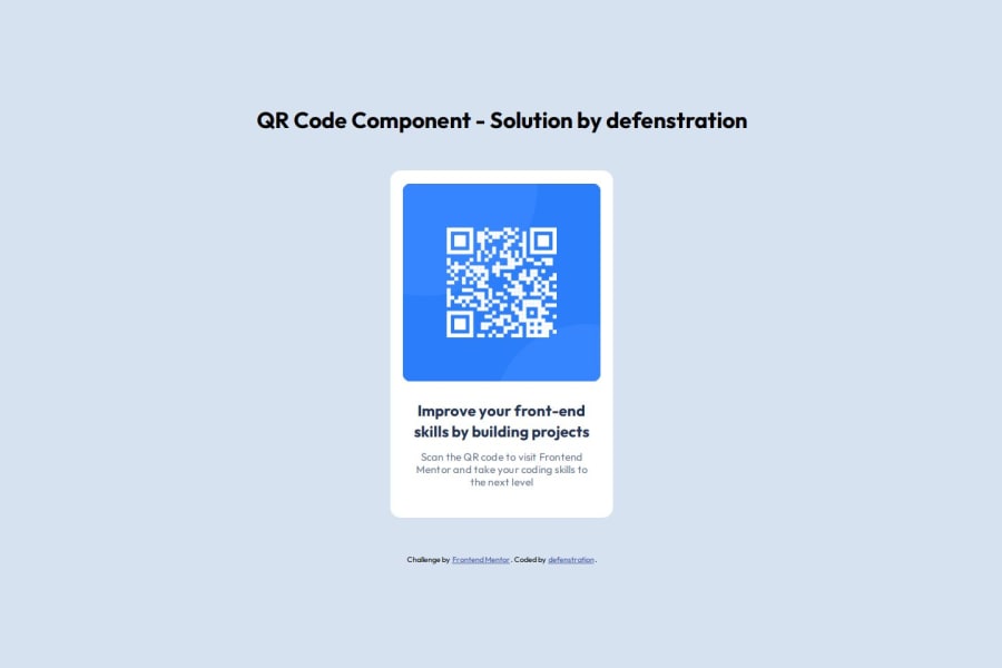
Design comparison
Solution retrospective
I am happy to have taken this step down the road towards frontend development. I have a lot to learn, but I'm excited to keep going.
In future projects I'll use more technologies and frameworks. Next time I am going to pick a challenge that requires javascript.
What challenges did you encounter, and how did you overcome them?I tried to overuse flexbox in this project, and the spacing got weird. I cut down on it and the project was much easier.
What specific areas of your project would you like help with?I have a couple of items in my reset that I know don't need to be there for this project, but are things I am trying to set to include by habit. I find myself overcomplicating things in my coding, so tips on streamlining code is always something I am looking for.
Community feedback
- @helenhappPosted 9 months ago
Hey there! 🙋🏽♂️
Congrats on completing the challenge! ✅
Your project looks fantastic!
The screenshot looks very close to the original design. But I see that you changed the code since then and added the h1 element before the main, and it messed up the layout. If you want to have the h1 element on your page for accessibility purposes but do not need it for the part of the website you are developing (like the QR code component), you can hide it from visual display using CSS like this:
.sr-only {
    position: absolute;
    width: 1px;
    height: 1px;
    margin: -1px;
    padding: 0;
    overflow: hidden;
    clip: rect(0, 0, 0, 0);
    white-space: nowrap;
    border: 0;
}
Hope this helps!
Keep up the great work!
Marked as helpful1P@defenstrationPosted 9 months ago@helenhapp
Thank you! I'm still playing with it actually. I ended up changing some positions to get things to line up again.
My changes were almost all done for accessibility warnings on the report. I am still learning about all of the different things involved. The .sr-only that you shared is something I have seen on some vids, but have never used. I think it's a good thing to add to my default css.
Thank you again, I really appreciate the help!
0 - @yujinyuzPosted 9 months ago
Looks great! Awesome that you made it a 1:1 copy. Mine was quite off but I just wanted progress so I left it as it is.
0
Please log in to post a comment
Log in with GitHubJoin our Discord community
Join thousands of Frontend Mentor community members taking the challenges, sharing resources, helping each other, and chatting about all things front-end!
Join our Discord
