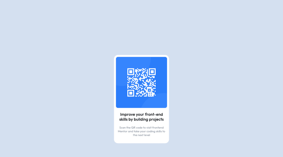
Design comparison
Solution retrospective
Is there any better alternative way to make this using just html and css? Please let me know how i could make my code better.
Community feedback
- @kxnzxPosted over 2 years ago
Hello Aryan,
You did a pretty good job for your first challenge. I have some suggestions:
When you start a project like this it is important to first start with a good understanding of HTML. You did a good job by wrapping the elements in a div, but you are missing semantic tags:
- Wrap your background div in a <main> </main>
- Wrap the title "Improve your front-end skills by building projects" in a <h1> </h1>
Semantic tags structure the page and helps the browser and the developer understand what the meaning of the content is. Semantically correct HTML also helps search engines and screen readers.
When you finished the HTML you can use a Markup Validation to inspect if you did it correct. Only then I would go begin with the design. Some tips:
- No need to use margin-top to center align a container on the page. To vertically & horizontally center the container use this:
body { display: grid; place-items: center; }
-
Define the max-width of the card/container/box.
-
For the background of the card; never use height, use padding.
You can always check my finished solution as guidance.
Hope you learned something.
Marked as helpful0 - @WardinulPosted over 2 years ago
Hello Aryan! You did very good, but we can make improvements.
What you can do first in this code is to change the class name of
.background
in.card
or.card-container
, or you can change it from a div to a<main>
for example because I did not know at first what was it about, I thought it was for the main body to give it a background for the whole page. It is very important to give intuitive class names for others to to find out faster what components you styled, and if the code gets more complicated you can even use comments for this.There is a better practice to begin the CSS code, and it sounds like this:
*, *::before, *::after { box-sizing: border-box; margin: 0; padding: 0; }
I will leave you a YouTube link where it is explained why is good to begin like that.
Another thing is how to center the card, and for this you can delete the margins of the card and adding these styles for the body:
body { display: flex; justify-content: center; align-items: center; min-height: 100vh; background-color: #d4e0ef; font-family: 'Outfit', sans-serif; font-size: 15px; }
Now everything should be centered.
Another improvement is to delete the margins of the
.img-container
, and just give a padding of 15px to the card (.background
). Also change thewidth
andheight
of the .img-container
tomax-width: 100%
. When you want to make everything responsive, it is recommended to use onlymax-width
ormax-height
instead of specific widths and heights. You will see now that the image is not centered correctly and is too big, and this is because of theposition: absolute
. Delete the position and everything should be fine. Be careful with the positions cause they can be very tricky.Ah and when it comes to an image that you want to be responsive inside a div, you can just give it a max-width of 100% and everything should be fine.
Hope I helped you a little :D
0 - @ChristopherParkePosted over 2 years ago
Hey Aryan,
Yes, there is. What you would do is put the code in a framework. I finished this challenge using React.js, so if you want to have a look at my profile, you can see how I wrote the code. Mine is also pixel perfect since I have pro and used the Figma.
Cheers,
Chris.
0
Please log in to post a comment
Log in with GitHubJoin our Discord community
Join thousands of Frontend Mentor community members taking the challenges, sharing resources, helping each other, and chatting about all things front-end!
Join our Discord