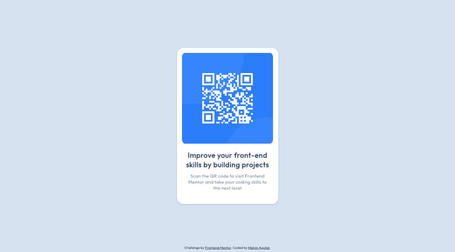
QR Code Component (SASS + Flexbox + BEM)
Design comparison
Solution retrospective
Hi there 👋, I’m Melvin, and this is my solution for this challenge. 🚀
🛠️ Built With:
- SASS. 🎨
- Flexbox layout. 📏
Any suggestions on how I can enhance this solution or achieve even better performance are welcome!
Thank you. 😊✌️
Community feedback
- @correlucasPosted over 2 years ago
👾Hi @MelvinAguilar, congratulations on your solution!
Great solution and a great start! From what I saw you’re on the right track. I’ve few suggestions for you that you can consider adding to your code:
1.Clean your code by removing some unnecessary divs, most of the content can stand alone without a div. Use div only for blocks that need a special alignment or the content needs a special positioning.
2.Use relative units as
remoreminstead ofpxto improve your performance by resizing fonts between different screens and devices. These units are better to make your website more accessible. REM does not just apply to font size, but to all sizes as well.3.Add
<main>instead of<div>to wrap the card container. This way you show that this is the main block of content and also replace the div with a semantic tag.Here's my solution for this challenge if you wants to see how I build it: https://www.frontendmentor.io/solutions/qr-code-component-vanilla-cs-js-darklight-mode-nS2aOYYsJR
✌️ I hope this helps you and happy coding!
Marked as helpful2@MelvinAguilarPosted over 2 years ago@correlucas Thanks for the feedback! I will definitely take it into account in my next challenges!
0@MelvinAguilarPosted over 2 years agoHi @Frank2522, I'm not correlucas but I saw your comment, Here is an complete guide to submitting solutions: https://medium.com/frontend-mentor/a-complete-guide-to-submitting-solutions-on-frontend-mentor-ac6384162248
The full summary of creating and publishing your solution is:
- Accept the challenge
- Create a public repository in GitHub to share your code with the community
- Build your project
- Deploy your project
- Submit your solution
0 - @LilithNixxPosted about 2 years ago
How did you managed to do it exactly the same size as the original?
1@MelvinAguilarPosted about 2 years ago@LilithNixx Hola !!!
Utilizo una extensión llamada PerfectPixel para poner la imagen previa encima de la solución que estoy haciendo, luego simulo una pantalla (1440px de ancho) usando DevTools para que se vea lo más parecido posible.
1@LilithNixxPosted about 2 years ago@MelvinAguilar gracias por compartir tu conocimiento.
0 - @IonCatanaPosted over 1 year ago
Perfect Job!!! I've noticed that you're experiencing a similar issue like me with the font-family. It appears to be a bug. Do you know something about it???
0 - @chrisjay358Posted about 2 years ago
Hi Melvin, that's great work you've done here. It is the striking resemblance for me. I just went through your code and wonder why you don't use this.
* {
  padding: 0;
  margin: 0;
}
I think it saves you from long codes.
0@MelvinAguilarPosted about 2 years ago@chrisjay358 Hi!!! In all projects I use a CSS reset, using what you mentioned is fine, but it's something simple compared to all the styles that a CSS reset eliminates, more lines of code are created but it brings more benefits, the one I use is this: https://github.com/jgthms/minireset.css, and all I do is copy and paste it, greetings.
2@chrisjay358Posted about 2 years ago@MelvinAguilar I get you, it is a good reset. There are tons of CSS reset out there, you just find the one that works best for you.
Regardless, I think you're doing an amazing job here. I'm beginning to wonder how you get the exact sizes of most of the challenges.
Keep winning and growing Melvin.
0
Please log in to post a comment
Log in with GitHubJoin our Discord community
Join thousands of Frontend Mentor community members taking the challenges, sharing resources, helping each other, and chatting about all things front-end!
Join our Discord
