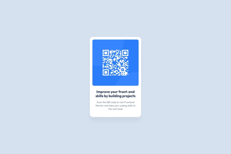
Design comparison
Solution retrospective
desktop only, have not learned responsive design yet
Community feedback
- @AshxaryaPosted almost 2 years ago
Hi! 😊
I have some feedback to help you out.
Make sure you look at the accessibility report you're provided with below your solution.
HTML 📄:
As you can see in your accessibility report, you are recommended to use a level-one heading for the first text. H tags improve user experience in the sense that they're part of a web page's hierarchical structure. Think of them less as a way to size font and more of a way to show the order of headings, since the size can be manipulated in CSS regardless.
I see you decided to remove the attribution, if in the future you decide to place it at the bottom make sure to use the <footer> tag to wrap the footer of the page instead of the <div class="attribution"> you are given in the original file. The <footer> element contains information about the author of the page, the copyright, and other legal information.
Make sure to add alternative text in your images. To do this simply add (alt="") for ex. <img src="icon-music.svg" alt=""> You can either add info about the image in that section or leave it blank depending on what the image is.
CSS 🎨: For ease of access in future projects, you can create variables of different colors at the beginning of your sheet. You can read more here to learn about this here.
You may want to also use rem instead of pixels for font-sizes! You can learn more about this topic here , similarly you can search for why you might want to use em values instead of px for padding, margins etc in some cases aswell.
Have a great day/night ^^
Marked as helpful0
Please log in to post a comment
Log in with GitHubJoin our Discord community
Join thousands of Frontend Mentor community members taking the challenges, sharing resources, helping each other, and chatting about all things front-end!
Join our Discord
