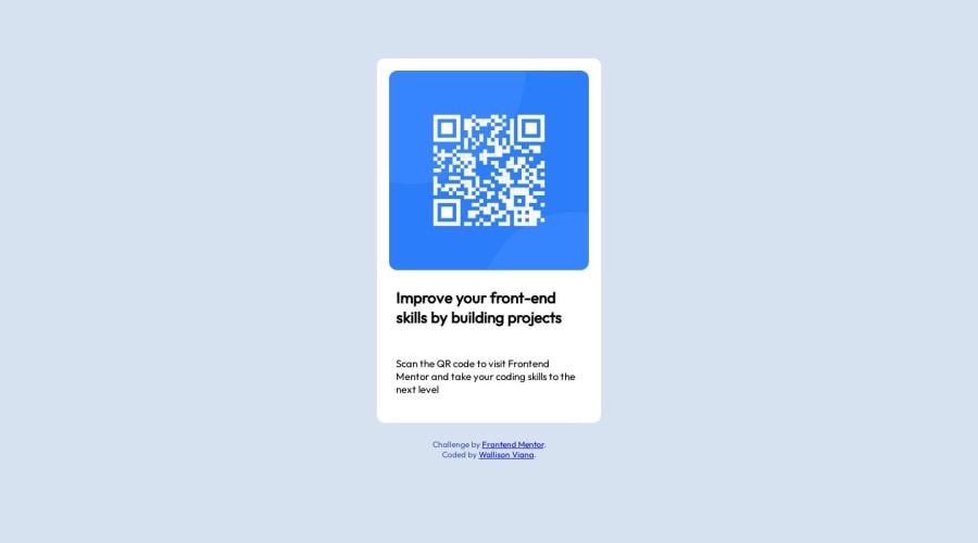
Design comparison
Community feedback
- @0xabdulkhaliqPosted almost 2 years ago
Hello there 👋. Congratulations on successfully completing the challenge! 🎉
- I have other recommendations regarding your code that I believe will be of great interest to you.
QR iMAGE ALT TEXT 📸:
- The QR Code Component involves scanning the QR code, the image is not a decoration, so it must have an
altattribute which should explain the purpose of theimage.
- The
altwithImagem do QR codeis not even explaining for what the QR image need to be used.
- So update the
altwith meaningful text which explains likeQR code to frontendmentor.io
- Example:
<img src="/images/image-qr-code.png" alt="QR code to frontendmentor.io">
.
I hope you find this helpful 😄 Above all, the solution you submitted is great !
Happy coding!
Marked as helpful0 - @devjhexPosted almost 2 years ago
Hello @7Wall you've really done an excellent job on this challenge it really show that you push in a lot of effort into it, Great work. As a suggestion, in your HTML instead of using a div for the container class it is recommended to use more accessible elements like the article element which will be so helpful for accessibility most especially screen readers to understand how your code is structured, other than that you have really done it well. Happy coding!!
Marked as helpful0
Please log in to post a comment
Log in with GitHubJoin our Discord community
Join thousands of Frontend Mentor community members taking the challenges, sharing resources, helping each other, and chatting about all things front-end!
Join our Discord
