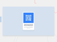
Design comparison
Community feedback
- @correlucasPosted about 2 years ago
👾Hi , congratulations on your solution!👋 Welcome to the Frontend Mentor Coding Community!
Great solution and a great start! From what I saw you’re on the right track. I’ve few suggestions for you that you can consider adding to your code:
1.Something that can be a time saver for you is to use a CSS RESET to remove all default settings for margins, making the images easier to work, see the article below where you can copy and paste this CSS code cheatsheet: https://piccalil.li/blog/a-modern-css-reset/ Use
<main>instead of a simple<div>this way you improve the semantics and accessibility showing which is the main block of content on this page. Remember that every page should have a<main>block and that<div>doesn't have any semantic meaning.2.Add the
alt textto improve accessibility.The alt attribute provides alternative information for an image if a user for some reason cannot view it (because of a slow connection, an error in the src attribute, or if the user uses a screen reader). ---><img src="./images/image-qr-code.png" alt="QR Code Frontend Mentor">3.Something that can be a time saver for you is to use a CSS RESET to remove all default settings for margins, making the images easier to work, see the article below where you can copy and paste this CSS code cheatsheet: https://piccalil.li/blog/a-modern-css-reset/
Here's my solution for this challenge if you wants to see how I build it: https://www.frontendmentor.io/solutions/qr-code-component-vanilla-cs-js-darklight-mode-nS2aOYYsJR
✌️ I hope this helps you and happy coding!
Marked as helpful1
Please log in to post a comment
Log in with GitHubJoin our Discord community
Join thousands of Frontend Mentor community members taking the challenges, sharing resources, helping each other, and chatting about all things front-end!
Join our Discord

