Design comparison
Solution retrospective
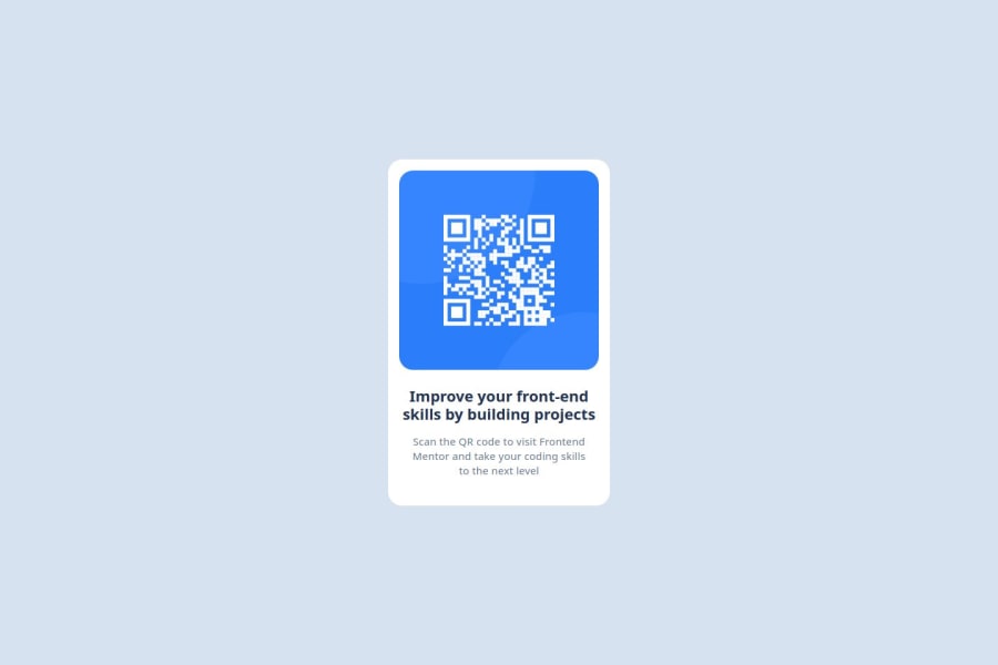
I am proud of completing the task. I would like to fix the width and height of the paragragh 1 "Improve your front-end skills by building projects". I would like to add media queries.
What challenges did you encounter, and how did you overcome them?I faced many challenges one of which was to put the component in the center of the page. I tried out a few things and took help from chatGPT by asking a doubt very specific to what I wanted.
What specific areas of your project would you like help with?- I would like to know about media queries, I would also like to learn more about transition: translate in CSS
- I would also like someone to review the code and help me out to make it better
Community feedback
- @henrychrisPosted 5 months ago
This looks great! The only difference is the font/text. If you wish to make it pixel perfect, you could reduce the spacing between the letters in the text.
0@PuneetSharmPosted 5 months agoThanks for the feedback @henrychris. But looking at the Figma file the letter spacing is needed in the 2nd text “Scan…..” of 0.2px and line height of 140%. Have I done something wrong while implementing the CSS?
0
Please log in to post a comment
Log in with GitHubJoin our Discord community
Join thousands of Frontend Mentor community members taking the challenges, sharing resources, helping each other, and chatting about all things front-end!
Join our Discord
