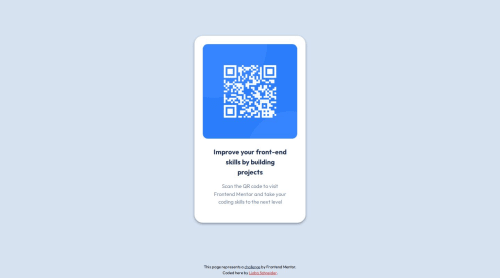
Design comparison
Solution retrospective
Being new to coding, I make so many mistakes I'm completely unaware of, but they must be glaringly obvious and some parts of my code might not make sense at all. I'd be so grateful for any pointers to be able to avoid them in the future. Also, how can I get closer to the original design (specifically on this project and in general)?
Community feedback
- @DylandeBruijnPosted 4 months ago
@lioba-s
Hiya! π
Congratulations on your solution, it looks very close to the design! I can tell you put a lot of effort into it.
Things I like about your solution π
- Responsive
- Use of semantic HTML elements
- Clear descriptive CSS classes
- Use of CSS custom properties
Things you could improve βοΈ
-
You can remove
flex: initial;
andposition: relative;
on yourbody
element. I think you left these while experimenting. As far as I can see they don't make a difference while trying to achieve your result. -
Try to get into the habit of using classes more instead of ID's for styling your elements.
-
Try experimenting more with Flexbox, the
gap
property is very useful for example.
I hope you find my feedback valuable, and I would appreciate it greatly if you could mark my comment as helpful if it was! π
Let me know if you have more questions and I'll do my best to answer them. πββοΈ
Happy coding! π
Marked as helpful0@lioba-sPosted 4 months ago@DylandeBruijn
Hi Dylan, thanks so much for taking the time and providing such helpful feedback. It was nice and easy to implement. I think I'll get back to this project in a while when I've gained more experience that will help me make improvements to it. π€
Oh, and the
position: relative
on thebody
(which I removed and then remembered π ) is there to keep the footer in place... (as described in this article: https://www.freecodecamp.org/news/how-to-keep-your-footer-where-it-belongs-59c6aa05c59c/ - feel free to tell me if you think a different approach would be more suitable here.I just had a look at your version of this project and it's impressive how closely it resembles the original. β¨ All the best to you! π
0 - @danielmrz-devPosted 4 months ago
Hello there!
Congrats on completing the challenge! β
Your solution looks awesome!
I saw that you used ID's and Classes on your project. They both work well but hey have a few differences:
IDβs are unique
π Each element can have only one ID.
π Each ID can have an unlimited amount of Styles applied to it.
π Each page can have only one element with that ID.
π IDs use β#β in the CSS which can also be used as an identifier for HTML βJump Linksβ (hyperlinks). This allows you to jump from one place to another on the same web page and can also be used in creating a well-designed Table of Contents.
Classes are not unique
π You can use the same Class on multiple elements.
π Class naming is case sensitive.
π Classes use a β.β in front of the name in the CSS.
π Each Class can have an unlimited amount of Styles applied to it.
π You can use multiple classes on the same element.
I hope it helps!
Other than that, you did an excellent job!
0@lioba-sPosted 4 months ago@danielmrz-dev
Hi Daniel,
thanks a lot for your kind and motivating feedback! I made sure to use classes rather than ids. π
All the best to you π
0
Please log in to post a comment
Log in with GitHubJoin our Discord community
Join thousands of Frontend Mentor community members taking the challenges, sharing resources, helping each other, and chatting about all things front-end!
Join our Discord