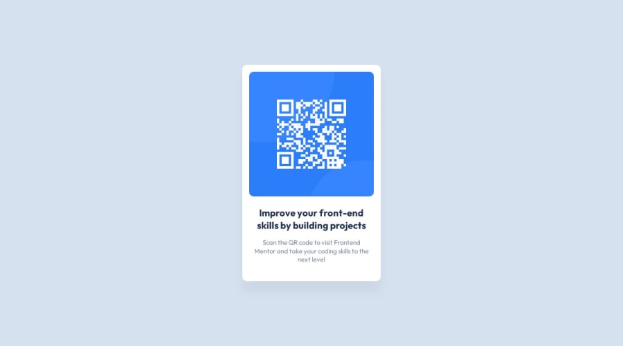
Design comparison
SolutionDesign
Community feedback
- P@MarioMinchevskiPosted almost 2 years ago
Here's a weird thing that I do not completely understand. On my screen for both desktop and mobile it is exactly as it is on the design screenshot. I used all the units from the Figma file and double checked it by measuring it with the Ruler extension on Mozilla Firefox. The solution sceenshot on FR, you can tell that by looking at the text.
Here it is in my browser.
https://prnt.sc/HBm6jnbJaMxD
0
Please log in to post a comment
Log in with GitHubJoin our Discord community
Join thousands of Frontend Mentor community members taking the challenges, sharing resources, helping each other, and chatting about all things front-end!
Join our Discord
