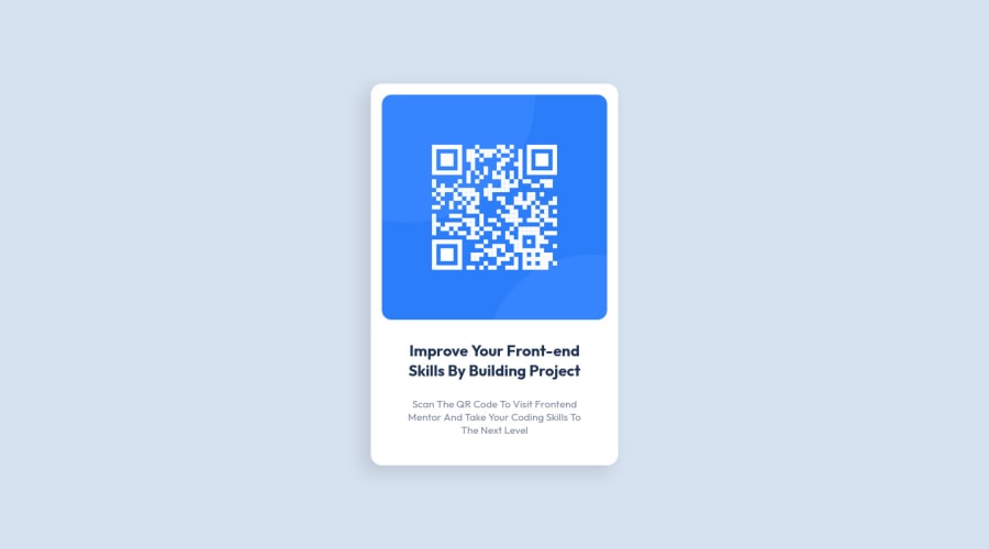
Design comparison
Solution retrospective
i tried my best and I know I am not doing this correct way so if you see anything wrong in my code please tell me
Community feedback
- @correlucasPosted about 2 years ago
👾Hi @nemesisaquib, congratulations on your first solution!
*’ve few suggestions for you that you can consider adding to your code:
1.Replace the
<h2>containing the main title with<h1>note that this title is the main heading for this page and every page needs one h1 to show which is the most important heading. Use the sequence h1 h2 h3 h4 h5 to show the hierarchy of your titles in the level of importance, never jump a level.2.Use relative units as
remoreminstead ofpxto improve your performance by resizing fonts between different screens and devices. These units are better to make your website more accessible. REM does not just apply to font size, but to all sizes as well.3.Reduce your code by removing unnecessary elements. The HTML structure is working but you can reduce at least 20% of your code by cleaning the unnecessary elements, you start cleaning it by removing some unnecessary
<div>. For this solution you wrap everything inside a single block of content using<div>or<main>(better option for accessibility) and put inside the whole content<img>/<h1>and<p>.<body> <main> <img src="./images/image-qr-code.png" alt="QR Code Frontend Mentor" > <h1>Improve your front-end skills by building projects</h1> <p>Scan the QR code to visit Frontend Mentor and take your coding skills to the next level</p> </main> </body>✌️ I hope this helps you and happy coding!
Marked as helpful0@nemesisaquibPosted about 2 years ago@correlucas thank you so much sir your feedback and I remember this I am still th learning rm and rem properties and I will remove unnecessary elements thank you so much 😃😃
0@nemesisaquibPosted about 2 years ago@correlucas yes sir it help me so much thanks a lot sir
1 - @cr1deg0Posted about 2 years ago
Hi Nemesis
Your solution looks great, well done! If you want to improve it, you could look into the accessibility and html issues in the report; perhaps replace the "section" tag by a "main" one and "h2" by an "h1".
You could also look into using rem/em units for padding and margin, rather than px.
Cheers
Marked as helpful0@nemesisaquibPosted about 2 years ago@cr1deg0 hi cristinaThank you very much for giving this information, next time I will take care and try harder 😊👍 Thank you sir
0 - @YehonatalPosted about 2 years ago
Looks Great! :)
0
Please log in to post a comment
Log in with GitHubJoin our Discord community
Join thousands of Frontend Mentor community members taking the challenges, sharing resources, helping each other, and chatting about all things front-end!
Join our Discord
