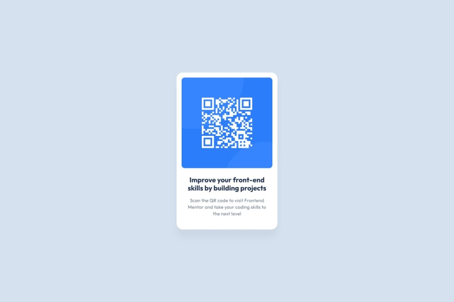
Design comparison
Solution retrospective
I'm happy I had enough knowledge to replicate the style of the page without needing assistance. I would spend more time learning flexbox so I don't have to redo part of the project.
What challenges did you encounter, and how did you overcome them?I have no knowledge of flexbox positioning, so I had to look for help on discord.
What specific areas of your project would you like help with?I am having issues with having my images show up on my github site. I need to figure out what I've done wrong.
Community feedback
- @grace-snowPosted 8 months ago
Hi I hope these tips are helpful. They should set you up well for future projects as well...
- All content should be contained within landmarks. Wrap the container div (the QR code card component) in a
main
. This isn't strictly necessary for a single component challenge but is a good habit to get into straight away so it doesn't get missed later. (Every page must have a main). - The image in this is really important content, the most important in fact. That means it needs really good alt text. This should say what the image is (QR code) and where it goes (to FrontendMentor.io). Imagine there are several QR cards on a page (very common for card components like this) — it would be no good if every image had the same alt text of "QR code" only. Give it more info.
- All content cannot be headings. Headings are extremely important elements and must be used appropriately. They are what communicates the structure of the content on a page and how many people navigate when using assistive tech like screen readers. Looking at the design, this component should have one heading and one paragraph.
- There is no need for a strong tag in this. That is for adding emphasis.
- Get into the habit of including a full modern css reset at the start of the styles in every project. Andy Bell or Josh Comeau both have good ones you can look up and use.
- Font size must never be in px. This is very important.
- The card should have padding on all sides and the child elements inside the card should only have vertical margins. Make sure you understand the difference between padding and margin.
- The max width on the component should be in rem not px. This allows it to scale correctly for all users, even those of us who change their default text size.
- Border radius should not be in percentage unless you have a square or circular item. For rectangular shapes (like this card) the border radius becomes distorted because the sides of the component are not equal. Use a fixed unit like px (or rem if you want the border radius to scale with the chosen text size).
- The image must not have a max width in px. This should be max width 100% so it can't ever exceed it's container (already included in modern css resets). You can optionally add a width 100% if you like but this isnt strictly necessary.
Marked as helpful0 - All content should be contained within landmarks. Wrap the container div (the QR code card component) in a
- @CHarvey820Posted 8 months ago
I like the way you used percentages for the border-radius!
0@grace-snowPosted 8 months ago@CHarvey820 note percentage for border radius should only be used when items are always square or circular. If the element would ever be rectangular, percentage border radius would break it! That would cause very strange looking radiuses because it is calculated on each axis - so a % on one side will be different to the other unless the content has an aspect ratio of 1/1 (i.e. A square or a circle)
0
Please log in to post a comment
Log in with GitHubJoin our Discord community
Join thousands of Frontend Mentor community members taking the challenges, sharing resources, helping each other, and chatting about all things front-end!
Join our Discord