Not Found
Not Found
Not Found
Not Found
Not Found
Not Found
Not Found
Not Found
Not Found
Not Found
Not Found
Not Found
Not Found
Not Found
Not Found
Not Found
Not Found
Not Found
Not Found
Not Found

Submitted

QR Code Component, Responsive Web Design using HTML and CSS only

@1lbert

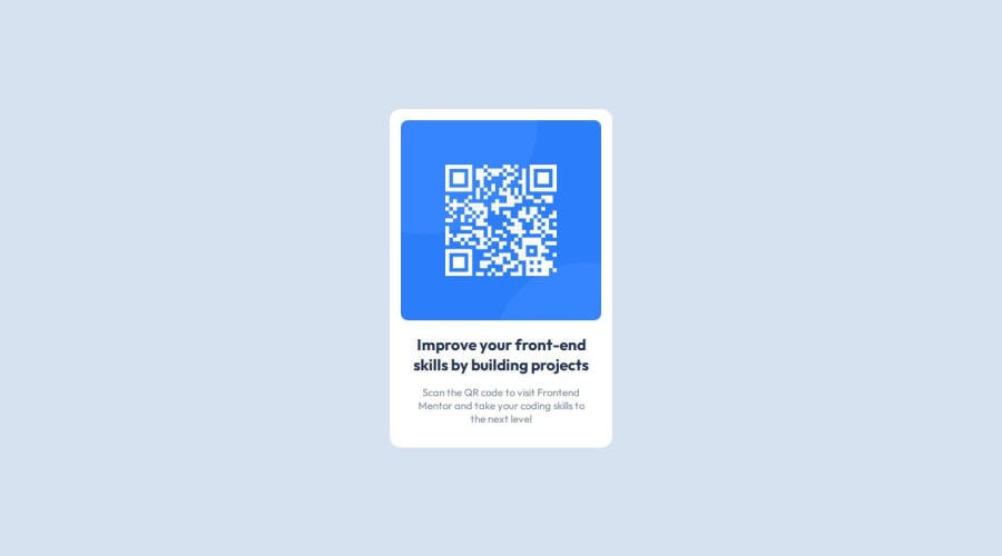
Desktop design screenshot for the QR code component coding challenge

This is a solution for...

  • HTML
  • CSS
1newbie
View challenge

Design comparison


SolutionDesign

Solution retrospective


What are you most proud of, and what would you do differently next time?

I'm proud of the overall process, It's my first time building a website just by copying from the reference and by only using my acquired skills.

What challenges did you encounter, and how did you overcome them?

linking style.css, linking fonts, and aligning the semantic main into the center, I feel noob because I already know it and I still make an error because of it.

What specific areas of your project would you like help with?

mastering proper declaration on css

Community feedback

T
Grace 29,910

@grace-snow

Posted

This has a few issues I can see.

  • the img doesn't need wrapping in an extra div. Try to keep html as lean as possible.
  • it's invalid to have width="320px" in html. That attribute doesn't accept units inside it. It also will damage performance having a width attribute without a height attribute on there as well. The only reason to have them is so that the browser knows the aspect ratio and can save the space for the image while it fetches it.
  • the image is the most important content on the page. It is definitely not decorative so must have a good alt description.
  • get into the habit now of always including a full modern css reset at the start of the styles in every project. It's not strictly necessary in this tiny project except for the image reset part, but it's still good to get into the habit of including it every time.
  • never limit the height of elements that contain text, including the body. Because this has been limited to a 100vh height, the background does not stretch beyond that and this looks broken on smaller mobiles, landscape mobiles and when people have a larger text size. Instead of height, use min-height so that the body can grow when it needs to.
  • the component must not have a width, and this definitely shouldn't be in px. This is causing the component to touch the edges of my screen in portrait view and is making it extremely narrow when I enlarge my text size. Instead, set a single max width in rem on the component. That allows it grow up to that max width, but also shrink narrower when it needs to. And my using rem it means the layout will scale along with the users chosen base text size.
  • Font size must never be in px.
  • give the component a little margin on all sides, or a wrapping element (like body) a little padding on all sides. This will prevent the component from touching screen edges, which it should never do.
  • has the footer been set as position absolute or something? I can't see that in the code but am seeing the footer overlap the card content in some views/zoom levels. That may also be being caused by the body having a limited height actually.

Marked as helpful

0

@1lbert

Posted

Hi Grace, Thank you for this input, I didn't realize all of this stuff until you mentioned it. I'll make sure to mind this next time.

  • I think I forgot to remove the width="320px" in HTML, It's just an experiment, and I completely forgot about this. hehe
  • the alt for the image, it's my fault for not putting it, I didn't realize the alt is missing in my image element
  • I actually don't know that there's a full CSS Reset, and since you mentioned it, I immediately searched what it means and the sample code. I also copy the temple of Josh W Comeau's Custom CSS Reset for my reference to the next projects, thanks!
  • I thought giving the height of 100vh gives my layout responsiveness to all views, but upon checking it in landscape mode, I just realized what you're talking about.
  • to be honest, I'm still in the process of getting familiar with width, max-width, and min-width. So, I better do more experiments on this topic.
  • I should set my fonts into rem.

Thank you for mentioning all of this, your comment is really helpful :)

0

Please log in to post a comment

Log in with GitHub
Discord logo

Join our Discord community

Join thousands of Frontend Mentor community members taking the challenges, sharing resources, helping each other, and chatting about all things front-end!

Join our Discord