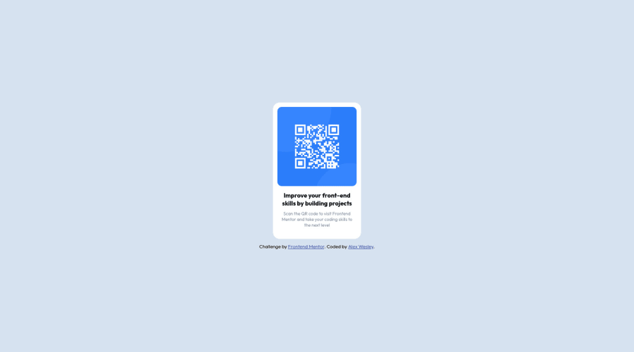
Design comparison
Solution retrospective
This is my solution for the QR code component . Any feedback is welcome! :)
Community feedback
- @PhoenixDev22Posted over 2 years ago
Hi @AlexWesleyy,
Congratulation on completing this frontend mentor challenge. Your solution looks great. I have some suggestions regarding your solution:
-
You should use
<main>landmark for the card and<footer>for the attribution. HTML5 landmark elements are used to improve navigation experience on your site for users of assistive technology. -
In my opinion,the alternate text in needed on this image. The alternate text should indicate where the Qr code navigate the user : like
Qr code to frontend mentor.
- Adding
rel="noopener"orrel="noreferrer"totarget="_blank"links. When you link to a page on another site usingtarget=”_blank”attribute , you can expose your site to performance and security issues.
There are a lot the arguments against the 62.5% font size trick ,it state that you should never change the root font size because it harms accessibility.
Aside these , Excellent work! hopefully this feedback helps.
Marked as helpful0 -
Please log in to post a comment
Log in with GitHubJoin our Discord community
Join thousands of Frontend Mentor community members taking the challenges, sharing resources, helping each other, and chatting about all things front-end!
Join our Discord
