

Design comparison
SolutionDesign

Solution retrospective
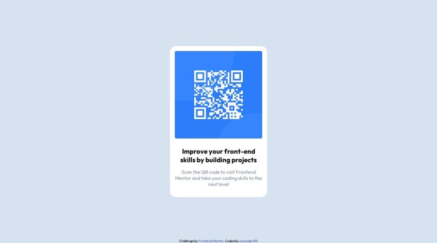
My hardest understanding of CSS is how to know what you need to write to get what you want. But im in start of learning CSS.
Community feedback
Please log in to post a comment
Log in with GitHub
Join our Discord community
Join thousands of Frontend Mentor community members taking the challenges, sharing resources, helping each other, and chatting about all things front-end!
Join our Discord