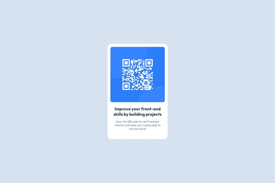
Design comparison
Community feedback
- @Mahmoud-Abdelkarim777Posted 4 months ago
I saw your coding, thanks for your effort but you should learn how to center the element in the middle of the screen using grid or flexbox. You should remove the very large margin from here .c { height: 470px; width: 300px; background-color: white; /* margin: 180px auto 0 auto; */ border-radius: 15px; } Here is a solution to your problem: body{ display: flex justifay-content: center align-items: center min-height: 100vh }
1 - @MarziaJaliliPosted 4 months ago
Bravo!!!!
Some tips for a cleaner CSS:
- use this lines of code in the
bodyselector to centerize the container instead of this linemargin: 140px auto 0 auto;:
display: grid; place-items: center; min-height: 100vh;- avoid using a fixed
heightfor the card. It isn't considered a good practice and there's no need for it when you have the lines above in thebody.
You can check out my solution for this challeng it is pretty straight forward, YOU WILL DEFINITELY BENEIFIT FROM IT!!!
Hope it was helpful😁😁
1@volti42Posted 4 months ago@MarziaJalili Thank you my brother :)! I will review my project again considering what you've written. :) Greetings from Turkey <3 see u.
0 - use this lines of code in the
Please log in to post a comment
Log in with GitHubJoin our Discord community
Join thousands of Frontend Mentor community members taking the challenges, sharing resources, helping each other, and chatting about all things front-end!
Join our Discord
