Design comparison
Solution retrospective
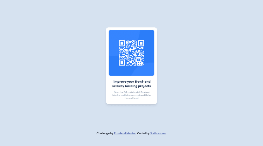
I need to do a text break with CSS, not in HTML, How to do that? Is my text correct or any other way to do better?
I removed unwanted div tags and set max-width instead of width and px to rem.
Community feedback
- @samantha-lindPosted about 2 years ago
Hi Sudharshan!
A simple way to make sure your lines break correctly is to set a width on your p class. If you remove the <br /> and pop this CSS against .p, it should show the same :)
width: 220px; (this constrains the paragraph to 220px wide, forcing the line to break once it hits the edge)
margin: auto; (this centers your paragraph)
Hope that helps!
Marked as helpful1@Sudharshan-24Posted about 2 years ago@samantha-lind thank you, Samantha, for your suggestion :) I will make changes to my code.
0 - @correlucasPosted about 2 years ago
👾Hi @Sudharshan-24, congratulations on your solution!👋 Welcome to the Frontend Mentor Coding Community!
Great solution and a great start! From what I saw you’re on the right track. I’ve few suggestions for you that you can consider adding to your code:
1.Clean your code by removing some unnecessary divs, most of the content can stand alone without a div. Use div only for blocks that need a special alignment or the content needs a special positioning.
2.Replace the
<h3>containing the main title with<h1>note that this title is the main heading for this page and every page needs one h1 to show which is the most important heading. Use the sequence h1 h2 h3 h4 h5 to show the hierarchy of your titles in the level of importance, never jump a level.3.Use relative units as
remoreminstead ofpxto improve your performance by resizing fonts between different screens and devices. These units are better to make your website more accessible. REM does not just apply to font size, but to all sizes as well.4.Add a margin of around
margin: 20pxto avoid the card touching the screen edges while it scales down.5.To maintain the card responsive use
max-widthinstead ofwidththis way you allow the content to be flexible. The difference betweenmax-widthandwidthis thatwidthis fixed andmax-widthhas a maximum size but can shrink to fit the content.Here's my solution for this challenge if you wants to see how I build it: https://www.frontendmentor.io/solutions/qr-code-component-vanilla-cs-js-darklight-mode-nS2aOYYsJR
✌️ I hope this helps you and happy coding!
Marked as helpful0@Sudharshan-24Posted about 2 years ago@correlucas Thank you so much, Lucas :) I will change all of the above points which you suggest to me.
0
Please log in to post a comment
Log in with GitHubJoin our Discord community
Join thousands of Frontend Mentor community members taking the challenges, sharing resources, helping each other, and chatting about all things front-end!
Join our Discord
