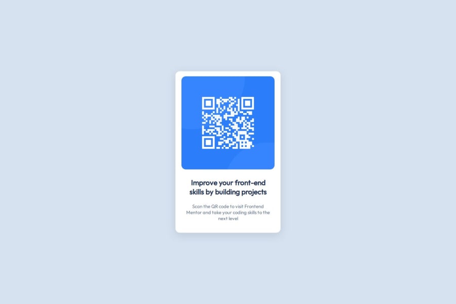
QR Code Component Responsive Design (HTML, CSS)
Design comparison
Community feedback
- @Augurk66Posted 7 months ago
Good job Adib! I love the simplicity of your code and I like your comments in your CSS code. This makes the code very readable for everyone.
-
I see that you use both px and rem for your
font-size. Using rem for all the font sizes improves the accessibility . I also used 15px for the text. Simple trick is to divide px by 16. In this case the paragraph would we approximately 0.9 rem. -
You don't need to use font-weight of 400 for your paragraph, as 400 is set by default.
-
In the HTML you are missing the
<main>element which is wrapping your content. Wrap the<div>in a main tag. I also made this mistake and now I am spreading this wisdom.
Marked as helpful1 -
Please log in to post a comment
Log in with GitHubJoin our Discord community
Join thousands of Frontend Mentor community members taking the challenges, sharing resources, helping each other, and chatting about all things front-end!
Join our Discord
