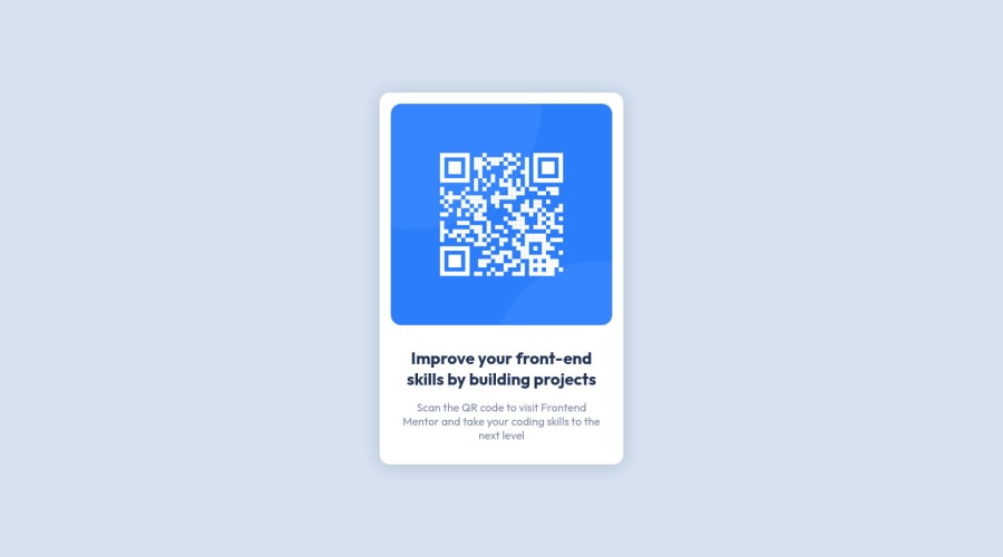
Design comparison
SolutionDesign
Solution retrospective
I remember doing the very first challenge on here and it took all day to figure it out lol. Now I was able to do this basic challenge in 15 minutes!
Community feedback
- @Kl3vaPosted about 3 years ago
Hi Aisha your solution looks great. You might want to remove the height property from the body and the flex value on display. If you need to align the container in that direction, you can simply set the margin to “margin: 0 auto; “ …that should align it in the center(vertically and horizontally)
0
Please log in to post a comment
Log in with GitHubJoin our Discord community
Join thousands of Frontend Mentor community members taking the challenges, sharing resources, helping each other, and chatting about all things front-end!
Join our Discord
