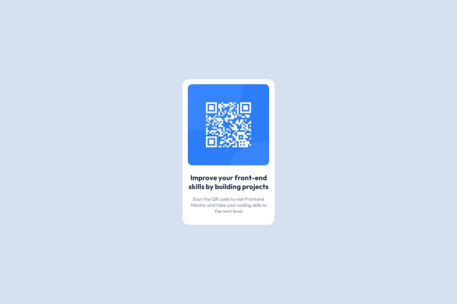
Design comparison
Solution retrospective
It was effortless to implement.
What challenges did you encounter, and how did you overcome them?To have the correct measurements was a challenge by looking up in Figma.
I improvised based on my instinct and it helped.
What specific areas of your project would you like help with?This was easy.
Community feedback
- P@developer-rubenPosted 12 months ago
Hi!
Welcome to the community! Here are my tips:
- Why did you use the <main> tag as the container for your component? This way you cannot implement it in other pages (since you can only have one main tag on a page). Try 'section' or 'article' instead, since this is an independent component
- Try keeping HTML and CSS code separate, even though it's a small component
- Search for the BEM methodology to better organise your code
- It's good to add the width and height in the HTML to prevent the page from scaling while loading the image
Marked as helpful0 - P@SrkiMaxPosted 12 months ago
I am just started coding myself, and I learn a lot by just looking at other people's code to see how they implemented the solution. I liked the way you positioned text(content) using this snippet in css: .content { padding: 4px 16px; }
Keep up the good work
0
Please log in to post a comment
Log in with GitHubJoin our Discord community
Join thousands of Frontend Mentor community members taking the challenges, sharing resources, helping each other, and chatting about all things front-end!
Join our Discord
