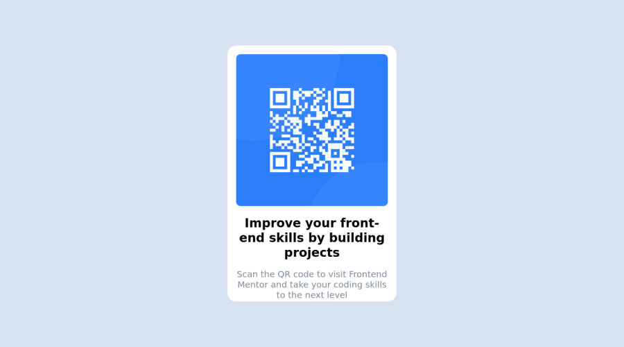
Design comparison
Solution retrospective
I tried using a media query, and found changing the size of the QR code based on the screen size a little troublesome. Is there a better way to go at this? Maybe using ems and rems?
Community feedback
- @Sarah-C-ArvinPosted over 2 years ago
I would recommend using the "mobile first" approach for literally every project you ever do. That's what I learned in the classes I took, anyway! It's much easier to progressively increase the size of your layout, than it is to try to fit all your content on a smaller screen if it's designed for desktop.
Instead of putting your mobile styles and measurements in your media query, design everything for the mobile design first, and then use a media query to tweak anything that needs tweaked for desktop.
This is a practice site I did in my class I took when we learned about responsive design, and I think it's a really good example of the mobile-first approach and media query use: https://github.com/Sarah-C-Arvin/Unplugged-retreat
Hope that helps! Keep up the good work!
Marked as helpful2@thejacksheltonPosted over 2 years ago@Sarah-C-Arvin will do! I'm looking at the code on your github, is there a way I can view the site? Thanks for the help!
0@Sarah-C-ArvinPosted over 2 years ago@thejackshelton Of course! Here's the link for the GitHub page: https://sarah-c-arvin.github.io/Unplugged-retreat/
0 - @CyrusKabirPosted over 2 years ago
Hello my dear friend ♥ you did good on this challenge and here some tips for your code and result :
- first, don't use id for css styles if you ask
why?
here is some good links and try to read them one after another : first: Specificity in css, second: reasons not to use IDs in css - actually, you don't need to change size of a pic or image with @media or any other ways, instead you can make an img tag completely responsive with just some few lines like this :
img {max-width: 100%; display: block}
with this you can have the guarantee the size of your pic or qr-img here for example never get more than it's container width - also you can check this good mini course in web.dev about responsive design in different concepts typo, images, ..... Learn Responsive Design
Marked as helpful0@thejacksheltonPosted over 2 years ago@CyrusKabir wow this was extremely helpful! I went ahead and read both of the articles you provided, changed my code to make images responsive with the snippet you provided, and I'm gonna look at that course, I appreciate it so much!!!!
1@CyrusKabirPosted over 2 years ago@thejackshelton your welcome, I am glad it was helpful. ♥
0 - first, don't use id for css styles if you ask
Please log in to post a comment
Log in with GitHubJoin our Discord community
Join thousands of Frontend Mentor community members taking the challenges, sharing resources, helping each other, and chatting about all things front-end!
Join our Discord