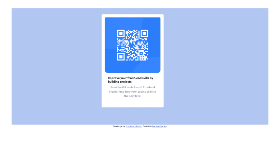
QR scanner using CSS Layout,and Bootstrap centered with flexbox
Design comparison
Solution retrospective
[Update]: I got help from https://github.com/Ashxarya.
I am a bit nervous about the way I brought the card to the center. Kindly have a look at my code and provide a better solution to this
Community feedback
- @AshxaryaPosted almost 2 years ago
Hi! 😊
I have some feedback to help you out.
Make sure you look at the accessibility report you're provided with below your solution.
HTML 📄:
As you can see in your accessibility report, you are recommended to use a level-one heading as in h1 instead of a h6 for the texts. H tags improve user experience in the sense that they're part of a web page's hierarchical structure. Think of them less as a way to size font and more as a way to show the order of headings, since the size can be manipulated in CSS regardless.
Use the <main> tag to wrap all the main content of the page instead of the <div> tag. With this semantic element you can improve the accessibility of your page.
Use the <footer> tag to wrap the footer of the page instead of the <div class="attribution">. The <footer> element contains information about the author of the page, the copyright, and other legal information.
CSS 🎨: For ease of access in future projects, you can create variables of different colors at the beginning of your sheet. You can read more here to learn about this here.
As for centering : One of the easiest ways to do this is by giving your body (which you seem to have named as frame in your stylesheet) a min-height of 100vh. Then using grid to center everything inside the body. For ex. ``` body {
min-height: 100vh;
display: grid;
place-items: center;
position: relative;
}```
For further understanding/alternative methods of centering, you can check out solutions from other people as their code can be accessed by everyone.
You may want to also use rem instead of pixels for font-sizes! You can learn more about this topic here , similarly you can search for why you might want to use em values instead of px for padding, margins, etc in some cases as well.
Have a great day/night ^^
Marked as helpful0@farsana-frPosted almost 2 years ago@Ashxarya A big Thanks to you for going through my code. You have carefully looked into code to provide this feedback. Great effort. I will improve this one. 👍
Have an Awesome Day
0
Please log in to post a comment
Log in with GitHubJoin our Discord community
Join thousands of Frontend Mentor community members taking the challenges, sharing resources, helping each other, and chatting about all things front-end!
Join our Discord
