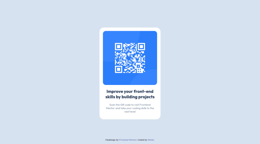
Design comparison
Solution retrospective
No mobile version
Community feedback
- Account deleted
Hello @Elis0u,
Your solution is almost complete and here are some tips you want to consider:
- Add min-height to your body element to center your card in the middle of the page
body{ min-height:100vh; }- Every document should contain
<main>instead of<div>because a<div>servers no purpose to describe content on a page. - More information about Semantic HTML Elements
I hope this helps you
Marked as helpful1 - @AdrianoEscarabotePosted about 2 years ago
Hi Elis0u, how are you?
I really liked the result of your project, but I have some tips that I think you will enjoy:
- every Html document must contain the main tag, so we can identify the main content, to fix this, wrap all the content with the main tag. HTML5 landmark elements are used to improve navigation experience on your site for users of assistive technology.
- To align some content in the center of the screen, always prefer to use
display: flex;it will make the layout more responsive!
Example:
body {
    margin: 0;
    padding: 0;
    display: flex;
    align-items: center;
    justify-content: center;
    min-height: 100vh;
}
The rest is great!
I hope it helps... 👍
Marked as helpful0 - @correlucasPosted about 2 years ago
👾Hi @Elis0u, congratulations on your solution!👋 Welcome to the Frontend Mentor Coding Community!
Great solution and a great start! From what I saw you’re on the right track. I’ve few suggestions for you that you can consider adding to your code:
- Use
<main>instead of a simple<div>this way you improve the semantics and accessibility showing which is the main block of content on this page. Remember that every page should have a<main>block and that<div>doesn't have any semantic meaning. - Replace the
<h2>containing the main title with<h1>note that this title is the main heading for this page and every page needs one h1 to show which is the most important heading. Use the sequence h1 h2 h3 h4 h5 to show the hierarchy of your titles in the level of importance, never jump a level. - Add a margin of around
margin: 20pxto avoid the card touching the screen edges while it scales down. - Use relative units as
remoreminstead ofpxto improve your performance by resizing fonts between different screens and devices. These units are better to make your website more accessible. REM does not just apply to font size, but to all sizes as well.
Here's my solution for this challenge if you wants to see how I build it: https://www.frontendmentor.io/solutions/qr-code-component-vanilla-cs-js-darklight-mode-nS2aOYYsJR
✌️ I hope this helps you and happy coding!
Marked as helpful0 - Use
Please log in to post a comment
Log in with GitHubJoin our Discord community
Join thousands of Frontend Mentor community members taking the challenges, sharing resources, helping each other, and chatting about all things front-end!
Join our Discord
