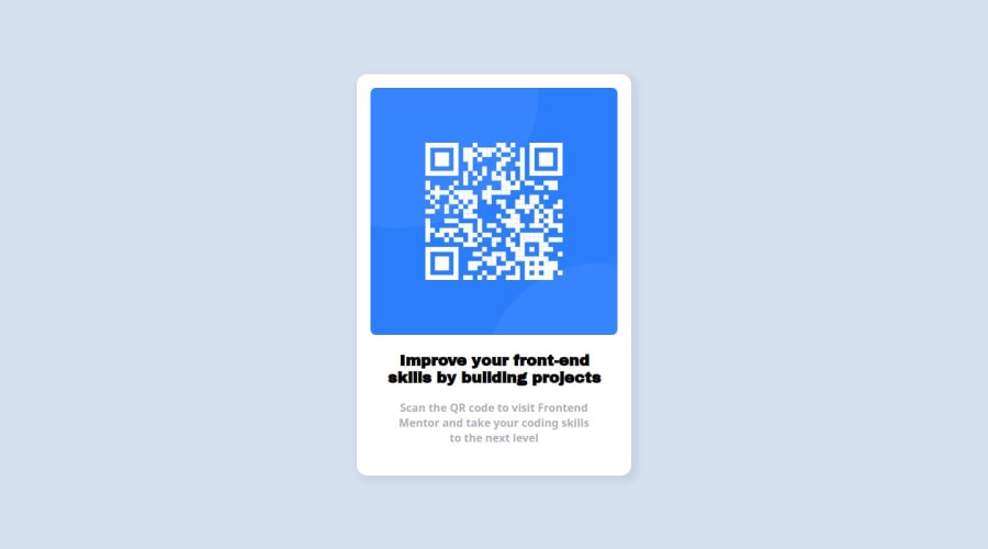
Design comparison
Solution retrospective
I'm most proud of being able to complete my first ever project on this site.
What challenges did you encounter, and how did you overcome them?The main challenges stemmed from CSS and using div elements to place the objects the way I wanted it to. Lots of trial and error and various YouTube videos later, I was able to get it right.
What specific areas of your project would you like help with?I would like feedback on the sizing and placement of the image as well as the text inside of my div element with a class of "box". Furthermore, I'd like to know how off I was with my paddings and if my alternative fonts are good enough to match the original in the design images.
Community feedback
- @MaxCodeCraftPosted about 1 year ago
Hi,
Im clearly a newbie so maybe someone will help you better but I think you should have used the box-sizing: border-box; property on your *{}, it may help you with your margins and paddings ?
Also, the style-guide.md in the starter files gave you the font-family and font-weights that should be used on this project.
Hope it helps a bit !
Marked as helpful0@BluffSet7340Posted about 1 year ago@MaxCodeCraft hey I appreciate the feedback, should've paid more attention to the given materials
0
Please log in to post a comment
Log in with GitHubJoin our Discord community
Join thousands of Frontend Mentor community members taking the challenges, sharing resources, helping each other, and chatting about all things front-end!
Join our Discord
