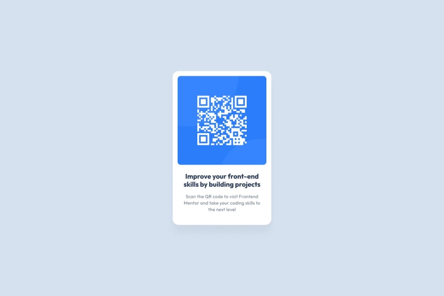
Design comparison
SolutionDesign
Community feedback
- @diaaFarisPosted about 2 years ago
Beautifully done. You can improve it more By :
- Increase the width of the component.
- Add some padding to the component (between 15px to 20px).
- Change the colors of the text to match the design in the picture.
But overall it is a great start. Keep going.
Marked as helpful1
Please log in to post a comment
Log in with GitHubJoin our Discord community
Join thousands of Frontend Mentor community members taking the challenges, sharing resources, helping each other, and chatting about all things front-end!
Join our Discord
