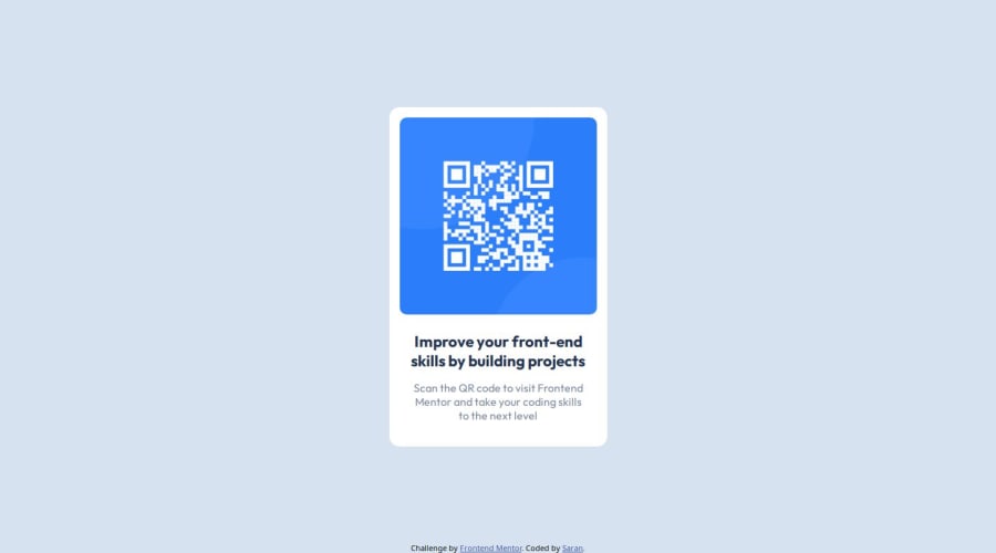
Design comparison
Solution retrospective
I think i made it similar 90%
What challenges did you encounter, and how did you overcome them?To make center
What specific areas of your project would you like help with?I am a beginner in frontend development. Help me to identify my mistake and correct it. send your feedbacks Thank you in advance
Community feedback
- @DanijelAdrinekPosted 8 months ago
hi sarank, your card is not perfectly centered, the body isnt 100% the width and height of the screen, the card's size doesnt match the size of the card in the design, your styles should be outside index.html, you will need to make a styles.css file that you need to link to your index.html file, the attribution shouldnt be taking up space which would allow you to perfectly center the card if you want to keep it, you can do that by adding position relative to container or body, and position absolute to attribution, then add property bottom: 0; to make it stay at the bottom of the screen.
as a frontend developer, you will also need to make sure your website matches the design perfectly, which means you will need to lower the size of the screen in your browser to match the size of the design, and then you will need to take a screenshot of it (I do it using ctrl + shift + s), after which you can paste the copied image into figma, add transparency of 50% to it, and put it on top of the design image to see if they match completely.
here is an example of how I did it in case you want to check it out and learn from it how I did it: https://www.frontendmentor.io/solutions/just-css-and-html-its-too-small-of-a-project-to-need-ro-add-anything-9zhphjxoE5
In case you have additional questions, feel free to reach out, I am here to help :)
Happy coding, and I hope you found this comment helpful :D
Marked as helpful0@Sarank20Posted 8 months agoHi Danijel Adrinek, Thank you for your suggestions it helped me a lot. now I correct my mistakes I followed your suggestion I took the screenshot and matched it in Figma and also I changed the footer.
here is the link if u have time check this https://sarank20.github.io/QR-code-component/ @DanijelAdrinek
1@DanijelAdrinekPosted 8 months ago@Sarank20 your font size on the text is inaccurate, it would be more accurate to just put 1 rem which is 16px instead of 0.9 rem, its not 15, but its not that big of a difference, thats how I did it, also I noticed you didnt use any css variables, even tho they arnt too useful on a project this small, I recommend you learn to use them well, they are a real life saver in bigger projects, and for bigger projects you wanna reorganize the structure a little, I recommend adding assets folder in which you can add folders like js, css, images, fonts, and in those folders is where you can write all your js, css, and add all the images and fonts you need, again, on project this small its not that big of a deal, but I still take this project to be practice for actual real projects, and think contcepts implemented in those projects would be good to train here too
Hope this helps, happy coding :)
0@Sarank20Posted 8 months agoOk I try to use your suggestion in my future projects @DanijelAdrinek
1 - @mkborisPosted 8 months ago
Hi Sarank20, great job, here are some suggestions
- All content should be wrapped within landmarks. Wrap a
main
tag around the container and afooter
for the attribution. - Add a
min-height: 100vh
onbody
- Font-size should be written in rem not px. This article explains it better Why font-size must NEVER be in pixels
- Your
img
should have an alt value to make it more meaningful and accessible. - Consider using a modern CSS reset at the start of the styles in every project. Like this one modern css reset.
Marked as helpful0@Sarank20Posted 8 months agoThank you for your suggestions it helped me a lot. now I have corrected my mistakes. now I can't understand CSS reset but I will learn CSS reset in the future @mkboris
1 - All content should be wrapped within landmarks. Wrap a
- @Harsh-Kumar-DwivediPosted 8 months ago
Hi @Sarank20,
Nice Work !
I would suggest following:-
1.You can prefer to replace
<div class="container">
with<main>
element.2.You can use
<h1>
element instead of<p>
element here:-<p class="heading"> Improve your front-end skills by building projects </p>
3.
<div class="container">
is sufficient,<div class="card">
is not needed.4.You can replace
<div class="attribution">
with<footer>
element.These will improve accessibility, make markup more semantic and reduce code.
Hope these suggestions are helpful !
Stay Happy & Well !
Keep up the good work !
Happy Coding !
Marked as helpful0@Sarank20Posted 8 months agoThank you for your suggestions it helped me a lot. now I correct my mistakes @Harsh-Kumar-Dwivedi
0
Please log in to post a comment
Log in with GitHubJoin our Discord community
Join thousands of Frontend Mentor community members taking the challenges, sharing resources, helping each other, and chatting about all things front-end!
Join our Discord