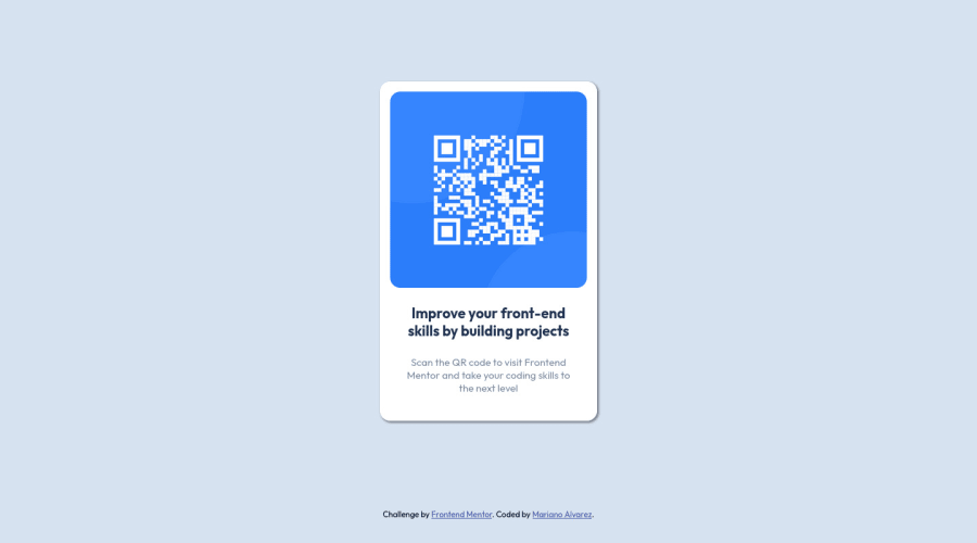
Design comparison
SolutionDesign
Solution retrospective
Any advice to improve my code is welcome.
Community feedback
- Account deleted
Instead of margins use flexbox. Remove the margins from the card and use the following on the body element.
display: flex;
justify-content: center;
align-items: center;
min-height: 100vh;
That will position the card in the center of the viewport. To fix the attribution getting in the way you can use the following on it:
position: absolute;
bottom: 0;
Marked as helpful0
Please log in to post a comment
Log in with GitHubJoin our Discord community
Join thousands of Frontend Mentor community members taking the challenges, sharing resources, helping each other, and chatting about all things front-end!
Join our Discord
