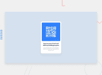
Design comparison
SolutionDesign
Solution retrospective
What specific areas of your project would you like help with?
PIease! Help me out with the responsiveness and code correctness.
- on the mobile version:
- the bottom text goes on the form.
- edge margins are not observed.
- the form itself:
- does not observe correct indentation (from photo, text) and I don't know how to fix it and make the code cleaner.
Community feedback
- @deux-triosPosted 4 months ago
CSS
- the margin and padding properties are redundant since you declared flexbox
- Everything else is right
HTML
- HTML code is right. No glaring errors.
I learned one thing from this code is that you have to wrap your texts in a div to make it compact and cleaner. Thank you One nitpick that I have is the padding on the texts are big, and the QR code is larger than the original design.
9/10
0
Please log in to post a comment
Log in with GitHubJoin our Discord community
Join thousands of Frontend Mentor community members taking the challenges, sharing resources, helping each other, and chatting about all things front-end!
Join our Discord

