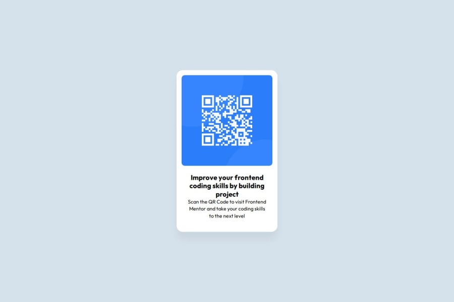
Design comparison
Solution retrospective
Honestly, the fact that I actually completed this project is a big win for me. But, i think I should strategize a better and efficient way to approach project issues because I spent too much time trying to figure out how to code this without using a flexbox and grid and that dragged too long. I was doing this in the midst of learning CSS but still..
What challenges did you encounter, and how did you overcome them?i was in the midst of learning CSS while doing this project, hence, why i didn't utilize Grid layout/flexbox properly, and yeah aligning the elements were a bit of a challenge but with more practice, it's more better now!
What specific areas of your project would you like help with?The biggest one would be to have a more efficient and cleaner code layout as mine's a bit messy and can be overwhelming when i revisited it to make some changes. Do please point out more effective ways to simply the code, for example, I'm pretty sure I over-used loads of CSS properties more than I needed.
Community feedback
- @grace-snowPosted about 2 months ago
Oh dear. Have a look again at the starter files - you should see some very important stuff that needs to go in the html head. It will have a comment above a meta tag saying its essential you don't remove it. You need to put this back in so the site can be viewed on different sized screens. It's super important!
Once that's done there are some other bits to adjust. You'll need to do one by one in this order:
- all content should be contained within landmarks. That means you need to wrap this card in a
main
element. Look up what landmarks are in html though so you know about others you'll need in future. - inside that main landmark you only need one div for the card. (Make sure you are working off the figma file or design image not preview image in the starter files).
- it's great you've added some alt text on the image, but this just needs to be a little more descriptive. As well as saying what the image is (QR code) it also needs to say where it goes (to FrontendMentor.io).
- one of the paragraphs in this needs to be a heading element. It's important when viewing a design to consider what should be a heading and what level you should use. Because this is just a card component, not a full Web page, and this card would never be used to serve the main heading on a page, you know it can't be a
h1
. So use the next level of importance down from that - ah2
. - in the styles get into the habit straight away of including a full modern css reset at the start of the styles in every project. Andy Bell or Josh Comeau both have good ones you can look up and use. Make sure you read the blog with it and understand what the properties in the reset are doing.
- remove all the widths and heights from the styles. Then keep reading this...
- give the body a min-height of 100svh. By default the body is only as tall as it's content. But this property tells the browser you want the body to be at least as tall as the viewport (so you can center the card on the screen).
- all the card needs to size it is a max width in rem. No height, no width needed. You can give it a % width if you want like 100% but it's not necessary.
- the card will need padding on all sides. This can be in px.
- the image can't be align items center so remove that too (it's doing nothing).
- font size must always be in rem, and never in pixels. These font sizes are far too small too. Check the figma for the sizes and convert to rem before use in code.
Marked as helpful1 - all content should be contained within landmarks. That means you need to wrap this card in a
- @KapteynUniversePosted about 2 months ago
For more clean code, i think you can add
font-family: Arial, Helvetica, sans-serif; background-color: hsl(212, 45%, 89%);
to body and remove font-family from .top and .bottom.
Also add
justify-content:center; min-height:100vh;
to body. This will center the whole card.
Delete whole attribute-1 style and div from css and html (don't delete the inside content in html ofc.),
margin-top: 60px; margin-left: 300px;
from squire.
align-items: center;
from img. Align-items is for the parent element that we use display: flex or grid. If you want to aim to the child element you can use align-self but i don't see any reason to use it here.Is there a reason to use
border: none;
with border-radius? Again, i don't see any reason to use border:none so i think you can delete that from .squire too.Also for next projects wrap the whole content in the body with main. Like
<body> <header> content </header> <main> content </main> <footer> content </footer> </body>
Header and footer is if needed. I don't think it is needed to use small project like this one but use main
You can check HTML semantics for more info.
You will not like this but try to use a css reset, like this one for every project. There are more than 1, you can look for modern css resets if you don't want to use this one.
Also use em/rem units instead of pixels and min/max values instead of hard coded hights and widths.
There are probably a couple of tweaks for responsiveness too but lastly, img alt tags needs to be meaningful for the screen-reader users, unless they are decorative, so in here i think it should be Frontend Mentor or https://www.frontendmentor.io instead of QR code. Not sure which one is better.
To understand flex and grid i usually look this sites. Flex, Grid
Marked as helpful1
Please log in to post a comment
Log in with GitHubJoin our Discord community
Join thousands of Frontend Mentor community members taking the challenges, sharing resources, helping each other, and chatting about all things front-end!
Join our Discord