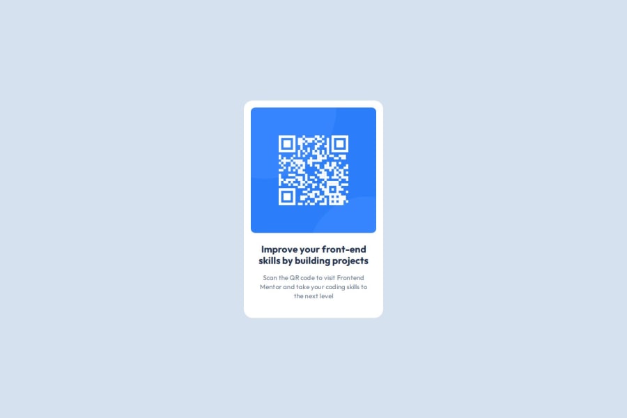


Design comparison

Solution retrospective
Nothing to be proud of
What challenges did you encounter, and how did you overcome them?I don't know how to implement the responsive design. I suppose the page should be more adaptive for different windows sizes but now I just use @media (max-width: 767px) to implement two sizes of the design. Desktop is 1440960 and mobile is 375812.
I'd like to hear opinions about what's wrong with my code from a senior frontend developer. Like if I align the elements correctly, is there a better way to implement and so on. I'm all ears and eagerly to know how a professional developer would do this.
Community feedback
- @maike-kramerPosted 4 months ago
The card is very good. You don’t need to use media for it to be responsive. You can set the container's width to 100% and the height to 100vh.
1

Please log in to post a comment
Log in with GitHub
Join our Discord community
Join thousands of Frontend Mentor community members taking the challenges, sharing resources, helping each other, and chatting about all things front-end!
Join our Discord