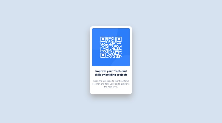
Design comparison
SolutionDesign
Solution retrospective
Q1. What could be the best practices to build this type of UI..?
Q2. Currently I have set the "display: flex; align-items: center; justify-content: center;" on the body in CSS. Is there any other way to make the div vertically aligned in centre?
Q3. Would that be better to use CSS Grids for this type of UI..?
Community feedback
- @half-ctoPosted almost 2 years ago
Hi, AMAN, congratulations on solving this challenge.
Q1 & Q2 Flex is a good solution for this type of layout since it will adjust to different screens.
Q3 In this case you could use many solutions, but again I think flex is great way to do this.
Some other things to consider:
<img>
should have alternate text<img src="./assets/illustration-app.png" alt="ilustration of app opened on smartphone">
for improved accessibility more here- Use semantic tags i.e.
<main>
instead of<div>
for main part of page - more here - Try to avoid skipping heading levels - for this layout You could use just one
<h1>
instead of<h3>
- more here
Marked as helpful0
Please log in to post a comment
Log in with GitHubJoin our Discord community
Join thousands of Frontend Mentor community members taking the challenges, sharing resources, helping each other, and chatting about all things front-end!
Join our Discord