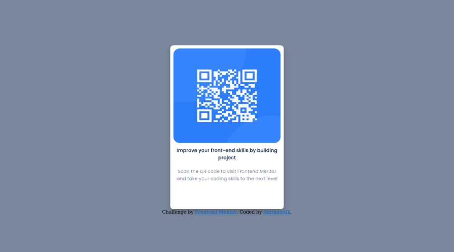
Design comparison
Solution retrospective
I had more difficulty with responsiveness, I couldn't make the text fit according to the screen. Any comments or tips for me to improve I would be very grateful
Community feedback
- @BABAR1532Posted over 1 year ago
I think you should add a margin to your lines according to your image. (Shrink it down your lines according to the image). [ I am also a newbie but it works for me]
0 - @LoaiEsam37Posted over 1 year ago
Hi adrianoAFK,
(in line 21) inside index.html replace the
<b>tag with<h1>tag because every page should contain level-one heading, also you can change the background-color of the page with this color#d5e1efhope you find this helpful
0 - @0xabdulkhaliqPosted over 1 year ago
Hello there 👋. Congratulations on successfully completing the challenge! 🎉
- I have other recommendations regarding your code that I believe will be of great interest to you.
HEADINGS ⚠️:
- This solution has generated accessibility error report due to lack of level-one heading
<h1>
- Every site must want at least one
h1element identifying and describing the main content of the page.
- An
h1heading provides an important navigation point for users of assistive technologies, allowing them to easily find the main content of the page.
- So we want to add a level-one heading to improve accessibility by reading aloud the heading by screen readers, you can achieve this by adding a
sr-onlyclass to hide it from visual users (it will be useful for visually impaired users)
CSS 🎨:
- The
background-coloryou applied for body is not correct, instead try this,
body {
     background-color: #D6E1F0;
}
.
I hope you find this helpful 😄 Above all, the solution you submitted is great !
Happy coding!
0
Please log in to post a comment
Log in with GitHubJoin our Discord community
Join thousands of Frontend Mentor community members taking the challenges, sharing resources, helping each other, and chatting about all things front-end!
Join our Discord
