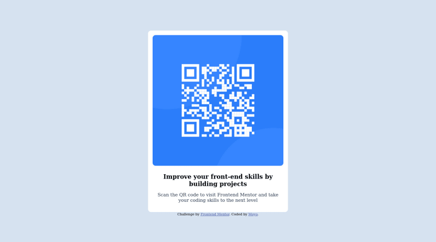
Design comparison
Solution retrospective
I started with mobile-forst workflow. I used a mobile phone to create the code as I don't have a laptop. However I don't know if the desktop view looks good enough. How did I do?
Community feedback
- @denieldenPosted almost 2 years ago
Hello Moyo, You have done a good work! 😁
Some little tips to improve your code:
- remove
max-width and marginfrom body - add
maintag and wrap the card for improve the Accessibility - also you can use
articletag instead of a simpledivto the container card for improve the Accessibility - add descriptive text in the
altattribute of the images - remove all unnecessary code, the less you write the better as well as being clearer: for example the
divcontainer of text - use
h1and not a simplepfor the title of the card - remove all
marginfrommainid - use flexbox to the body to center the card. Read here -> best flex guide
- after, add
min-height: 100vhto body because Flexbox aligns child items to the size of the parent container - use
classto style the element and not theidbecause ids must be uniques inside all the page - instead of using
px or %use relative units of measurement likerem-> read here
Keep learning how to code with your amazing solutions to challenges.
Hope this help 😉 and Happy coding!
Marked as helpful1 - remove
- @vanzasetiaPosted almost 2 years ago
Hi, Moyo! 👋
It is amazing that you were completing this challenge with a mobile device. Congratulations! 🎉
I was also coding on my Android device in 2021 to finish the Frontend Mentor challenges. I knew how hard it was to code on mobile especially to create a responsive website. I wrote an article about all the tools that I used to code on Android. I hope it helps.
The Ultimate Guide To Code On Android: It's Possible!
Now, about the responsiveness of the card, you can make it responsive with no media queries. The card only needs a
max-widthto prevent it from becoming too large while still allowing it to shrink if needed. You can see my solution as a reference.QR Code Component | HTML CSS coding challenge solution
Some more suggestions from me:
- Fix all the HTML errors that have been reported.
- The QR code is an important image so it must have alternative text.
- Don't use
idselectors for styling. There are two reasons for not using ID’s to style content:- They mess up specificity because they are too high (the most important reason).
- They are unique identifiers. So, they are not reusable on the same page.
- Use a CSS reset whenever you start a new project. This can help you set the styling foundation easily. A Modern CSS Reset
I hope this helps. Happy coding!
Marked as helpful1@MoyoSharonPosted almost 2 years ago@vanzasetia These links are really helpful. I'll make sure to apply their contents. Thank you
0 - @deveshshuklaPosted almost 2 years ago
Bro as you mentioned, You build the complete site by just using your phone... It's commendable. Actually, on the Desktop it's looking too big... but it's fine as you don't have a proper tool to shape the craft. 🫡 Next time try to see Desktop View so you will know what improvements you have to do & Font styling and Padding need to be done.
Marked as helpful1@MoyoSharonPosted almost 2 years ago@deveshshukla Thank you, I'll do the necessary corrections.
1
Please log in to post a comment
Log in with GitHubJoin our Discord community
Join thousands of Frontend Mentor community members taking the challenges, sharing resources, helping each other, and chatting about all things front-end!
Join our Discord
