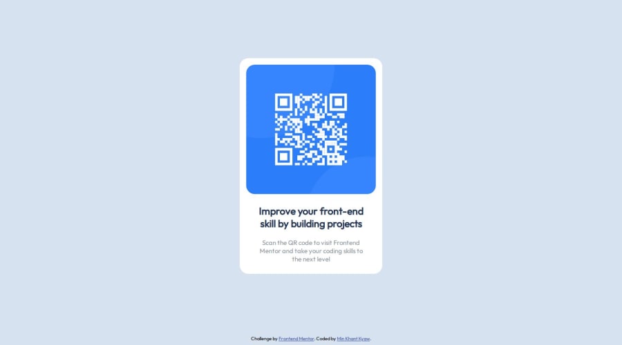
Design comparison
Solution retrospective
I'm proud of doing most of the work done by myself. I'll try to improve to handle this kind of work single-handedly.
What challenges did you encounter, and how did you overcome them?I did encounter my html body only taking half of the height and I got to google how to fix it. Only then, I was able to start with the flexbox.
What specific areas of your project would you like help with?I would like to ask seniors for feedbacks. My code is a mess as it seems to be. So... How can I make it better overall? I appreciate it, thanks.
Community feedback
- @RealKendprPosted about 1 year ago
I suggest to use a fluid size for your
.wrapper. Instead of using a 300px fixed width you can try to use%.Marked as helpful0 - @ArryBlackPosted about 1 year ago
Hi @mkhantk, great job! The code seems good. You can try making the wrapper div into a main tag for more semantic markup.
Marked as helpful0
Please log in to post a comment
Log in with GitHubJoin our Discord community
Join thousands of Frontend Mentor community members taking the challenges, sharing resources, helping each other, and chatting about all things front-end!
Join our Discord
