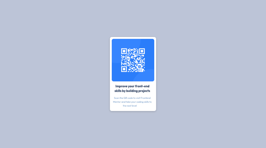
Design comparison
Community feedback
- @MelvinAguilarPosted about 2 years ago
Hi @danurag1906 👋, good job on completing this challenge, and welcome to the Frontend Mentor Community! 🎉
I have some suggestions you might consider to improve your code:
To improve HTML elements:
- Use the
<main>tag to wrap all the main content in your solution instead of using<div class="main">.
- Additionally, you can use the
<article>tag instead of div to the container card:<div class="card">.
- To make alternative texts more useful, add descriptive text to the alt attribute of the QR image to explain what the QR image does.
- Add an h1 tag to your solution. The
<h1>element is the main heading on a webpage, also, there should only be one<h1>tag per page.
<h1>Improve your front-end skills by building projects</h1>- It might be more efficient to use only one <p> tag:
<p>Scan the QR code to visit Frontend Mentor and take your coding skills to the next level</p>And update the styles to have the same result:
.content {
    /* line-height: 8px; */
}

h1 {
    font-size: 1rem;
    text-align: center;
    margin-inline: 1rem;
}

p {
    font-size: 0.8rem;
    text-align: center;
    margin-inline: 0.6rem;
}
Helpful resources:
I hope those tips will help you! 👍
Good job, and happy coding! 😁
Marked as helpful2@danurag1906Posted about 2 years ago@MelvinAguilar Hey! Thank you for your valuable feedback. I changed my code as per your suggestions.
1 - Use the
- @AdrianoEscarabotePosted about 2 years ago
Hi Anurag Daliya, how are you?
Welcome to the front-end mentor community!
I really liked the result of your project, but I have some tips that I think you will enjoy:
- every Html document must contain the main tag, so we can identify the main content, to fix this, wrap all the content with the main tag. HTML5 landmark elements are used to improve navigation experience on your site for users of assistive technology.
- Consider using rem for font size .If your web content font sizes are set in absolute units, such as pixels, the user will not be able to re-size the text or control the font size based on their needs. Relative units “stretch” according to the screen size and/or user’s preferred font size, and work on a large range of devices.
if you want to continue coding with px, you can download a very useful extension in vscode, it converts px to rem! link -> px to rem
The rest is great!
I hope it helps... 👍
Marked as helpful1 - @correlucasPosted about 2 years ago
👾Hi @danurag1906, congratulations on your solution!👋 Welcome to the Frontend Mentor Coding Community!
Great solution and a great start! From what I saw you’re on the right track. I’ve few suggestions for you that you can consider adding to your code:
- Use
<main>instead of a simple<div>this way you improve the semantics and accessibility showing which is the main block of content on this page. Remember that every page should have a<main>block and that<div>doesn't have any semantic meaning. - Replace the
<p>containing the main title with<h1>note that this title is the main heading for this page and every page needs one h1 to show which is the most important heading. Use the sequence h1 h2 h3 h4 h5 to show the hierarchy of your titles in the level of importance, never jump a level. - Add a margin of around
margin: 20pxto avoid the card touching the screen edges while it scales down. - Use relative units as
remoreminstead ofpxto improve your performance by resizing fonts between different screens and devices. These units are better to make your website more accessible. REM does not just apply to font size, but to all sizes as well.
Here's my solution for this challenge if you wants to see how I build it: https://www.frontendmentor.io/solutions/qr-code-component-vanilla-cs-js-darklight-mode-nS2aOYYsJR
✌️ I hope this helps you and happy coding!
0 - Use
Please log in to post a comment
Log in with GitHubJoin our Discord community
Join thousands of Frontend Mentor community members taking the challenges, sharing resources, helping each other, and chatting about all things front-end!
Join our Discord
