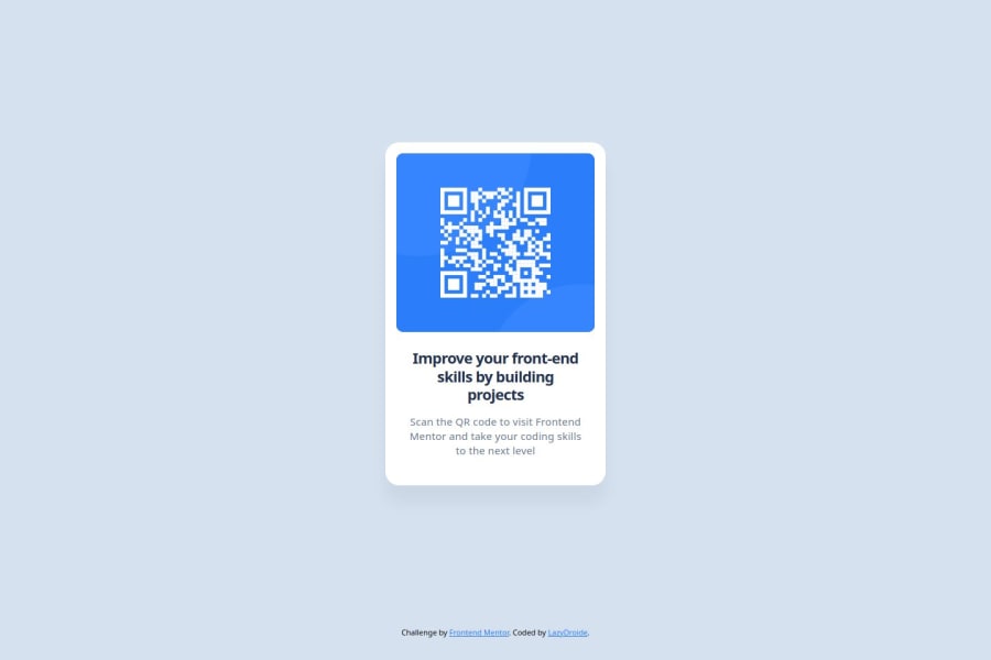
Design comparison
Solution retrospective
I think it has been a good first contact with figma and I've tried to use css variables to make the code more flexible as a good practice
Community feedback
- @AdrianoEscarabotePosted 6 months ago
Hi lazydroide, hope you're doing well! I loved how your project turned out, but I’ve got a few suggestions that could be useful:
Consider using
remfor font sizes. When font sizes are set in absolute units like pixels, users can't adjust the text size based on their preferences. Relative units likeremadapt to the screen size and user settings, making them more flexible across various devices.If you'd rather keep using
px, you can download a handy VS Code extension that converts pixels toremautomaticallylink -> px to rem
A document ought to have one primary landmark, and the absence of a main tag around the page's primary content is the root of this issue. On this page, there is no other element that is more important than the one that this challenge is based on, so to solve it, wrap all the content in the'main' tag.
It's always a good idea to pay close attention to the proper use of semantic html elements because they are crucial for screen reader users to understand what the main content of the page is in the case of the'main' tag!
The rest is fantastic.
Hopefully, you'll find it helpful. 👍
Marked as helpful0
Please log in to post a comment
Log in with GitHubJoin our Discord community
Join thousands of Frontend Mentor community members taking the challenges, sharing resources, helping each other, and chatting about all things front-end!
Join our Discord
