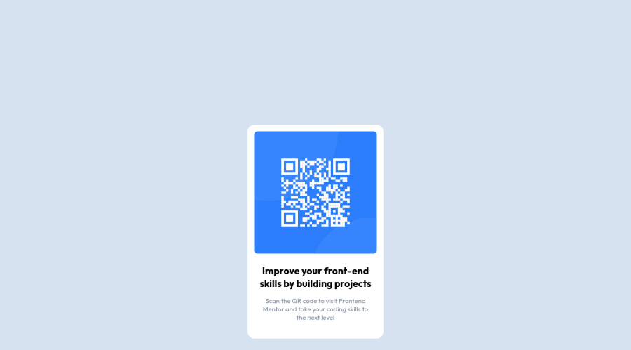
Design comparison
Solution retrospective
Great exercise to kick off my first solution on frontend mentor.
Community feedback
- @PhoenixDev22Posted over 2 years ago
Hello Yulin,
Congratulation on completing your first challenge. Your solution looks great. I have some suggestions regarding your solution if you don't mind:
You should use the
<main>landmark to wrap the card, and<footer>for the attribution. HTML5 landmark elements are used to improve navigation experience on your site for users of assistive technology.`Page should contain
<h1>. In this challenge , as it’s supposed to be a part of a whole page, you may use<h1>withsr-onlyclass hidden visually and present for assistive tech users.The alternate text should indicate where the Qr code navigate the user : like
Qr code to frontend mentor.Adding
rel="noopener"orrel="noreferrer"totarget="_blank"links. When you link to a page on another site usingtarget=”_blank”attribute , you can expose your site to performance and security issues.CSS:
In order to center the card on the middle of the page , you can use the flexbox properties and
min-height: 100vhfor the<body>add a little padding to the body that way it stops the card from hitting the edges of the broswer.- Using single class selector for styling.
Consider using rem and em units as they are flexible, specially for font size better to use rem. If your web content font sizes are set in absolute units, such as pixels, the user will not be able to re-size the text or control the font size based on their needs. Relative units “stretch” according to the screen size and/or user’s preferred font size, and work on a large range of devices.
width: 280px;an explicit width is not a good way. consider usingmax-widthto the card insteadAside from those , great job on this one.
Marked as helpful0 - @AsimKachhapPosted over 2 years ago
Hii Yulin, Good try but you can exactly match your solution with the design if you try to center your component.
I would suggest,
.container{ position:absolute; top:50%; left:50%; transform: translate(-50%,-50%); }
Marked as helpful0
Please log in to post a comment
Log in with GitHubJoin our Discord community
Join thousands of Frontend Mentor community members taking the challenges, sharing resources, helping each other, and chatting about all things front-end!
Join our Discord
