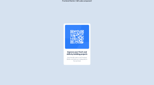
Design comparison
SolutionDesign
Solution retrospective
Hi everyone! I feel pretty confident about my solution, but if you notice anything I could improve, I'm all ears!
Thank you! :)
Community feedback
- @karishma-devPosted over 2 years ago
Hey, your solution looks good. Few suggestions:
- You haven't closed the link tag for importing the stylesheet, due to which you are having some HTML issues.
- Provide alternate text for images so if a person using accessible technologies or due to some reason cannot see the image, they will know what the image is about by reading this text.
- Your card is not properly centered. Add
display: flex; justify-content: space-between; align-items: center; flex-direction: column; min-height: 100vh;
to the body. In this, justify-content will make sure there is some space between your elements and align-items will align the content to the center. Removemin-height: 100vh
from your main tag, as it's causing the browser to have a scrollbar. - Add your "Frontend Mentor | QR code component" text in a tag, and add some margin-top to it. Also, add some margin-bottom in your footer so there is some space between the footer and the end of the page. (This will make the design of your page look better).
Hope this helps! :)
Marked as helpful0@aszcodingPosted over 2 years ago@krrish105 thanks so much for reviewing my code and for the feedback! I've made adjustments, and now my report comes back with zero issues found.
Thanks again! :)
1
Please log in to post a comment
Log in with GitHubJoin our Discord community
Join thousands of Frontend Mentor community members taking the challenges, sharing resources, helping each other, and chatting about all things front-end!
Join our Discord