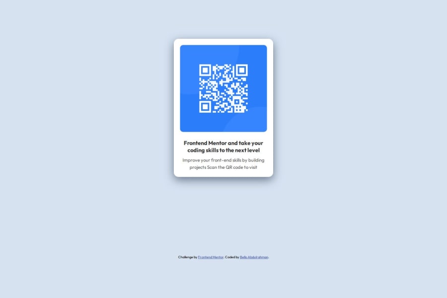
Design comparison
SolutionDesign
Community feedback
- P@Michal-MajchrzakPosted 5 months ago
Hey @aohinoyi 👋, great job on finishing the challenge
I have some suggestions to help improve your solution :
- text inside
h2andpelements should be switched in places. In the design the heading is Improve your front-end skills by building projects and the rest is in paragraph.
- there is additional left and right padding between text and edges of the QR image, you can add it to your
.card-textclass to make your solution look more like the design.
Happy Coding 😀💻
Marked as helpful0 - text inside
Please log in to post a comment
Log in with GitHubJoin our Discord community
Join thousands of Frontend Mentor community members taking the challenges, sharing resources, helping each other, and chatting about all things front-end!
Join our Discord
