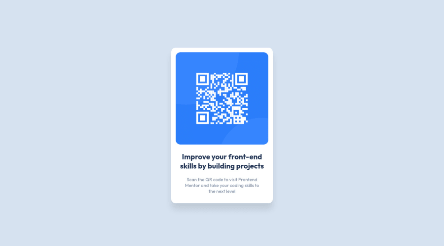
Design comparison
Solution retrospective
All feedback is welcome
Community feedback
- @kxnzxPosted over 2 years ago
Hello @bit-bayusaputra,
Congratulations with finishing your first challenge! You did a great job! You managed to make the design look similar!
I have some suggestions/learning points:
-
Instead of <div class="card"></div> use <main class="card"></main>. The main tag is considered an accessibility landmark and ensures that a screen reader and people with visual impairment have the ability to jump to sections of the page. Examples of landmarks are: header, nav, main, aside, section, footer.
-
It is good to use div’s for the purpose of styling and arranging components on the page. Div’s are like empty containers, but they do not have any semantic meaning. So instead of <div class="card-body"></div> use <section class="card-body"></section>. You can use the section tag when the content within it is related. As you can see the image with the QR Code and the description are related.
-
Wrap “Improve your front-end skills by building projects” into an <h1></h1> tag (not an h2). This is very important for search engines, screen readers, SEO and people with visual visual impairment to know what your page is about. You always need ONE h1 in your page. Then (when needed) you follow it up with subheadings such as an h2, h3, h4 etc. It’s the hierarchy that matters. In this challenge there are no subheadings, though. Just remember that the most important title on the page is an h1.
Keep on going to the next challenge! Best of Luck!
0 -
Please log in to post a comment
Log in with GitHubJoin our Discord community
Join thousands of Frontend Mentor community members taking the challenges, sharing resources, helping each other, and chatting about all things front-end!
Join our Discord
