

Design comparison
SolutionDesign

Community feedback
- P@jstrzyzykowskiPosted 2 months ago
Great job Mark!
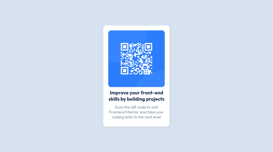
Based on screenshot view, there is a space for some potential improvements:
- card border radius
- card box shadow
- card padding
- gap between image and content
- second text size
- content for text has additional padding in X axis
0

Please log in to post a comment
Log in with GitHubJoin our Discord community
Join thousands of Frontend Mentor community members taking the challenges, sharing resources, helping each other, and chatting about all things front-end!
Join our Discord