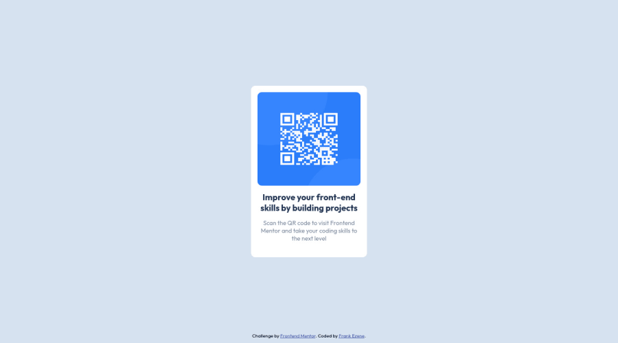
Design comparison
Solution retrospective
I found the project relatively easy, but I was slow with finding the right font-size. I am unsure of the padding. What is a best practice for line-height and general text in websites
Community feedback
- @HassiaiPosted almost 2 years ago
Replace<div class="card">with the main tag and <div class="attribution"> with the footer tag to fix the accessibility issues. click here for more on web-accessibility and semantic html
To center .card on the page using flexbox, replace the height in the body with min-height:100vh.
There is no need to give .card a height value and style. barcode. Give the img a max-width of 100% instead of a width and height value. Give p and h1 a font-size of 15px the same margin-left and margin-right values, the same margin-top value and give p a margin-bottom value.
Use relative units like rem or em as unit for the padding, margin, width values and preferably rem for the font-size values, instead of using px which is an absolute unit. For more on CSS units Click here
Hope am helpful.
Well done for completing this challenge. HAPPY CODING
Marked as helpful1@frank1003APosted almost 2 years ago@Hassiai Thank you for the tips and links: I have updated all. I took out the h1 tag and used a p tag everywhere, but the first p tag doesn't align as intended so I increased the font-size. Any idea on how to correct this without increasing the font-size
0@HassiaiPosted almost 2 years ago@frank1003A give both p and h1 the same margin-left and margin-right values.
1
Please log in to post a comment
Log in with GitHubJoin our Discord community
Join thousands of Frontend Mentor community members taking the challenges, sharing resources, helping each other, and chatting about all things front-end!
Join our Discord
