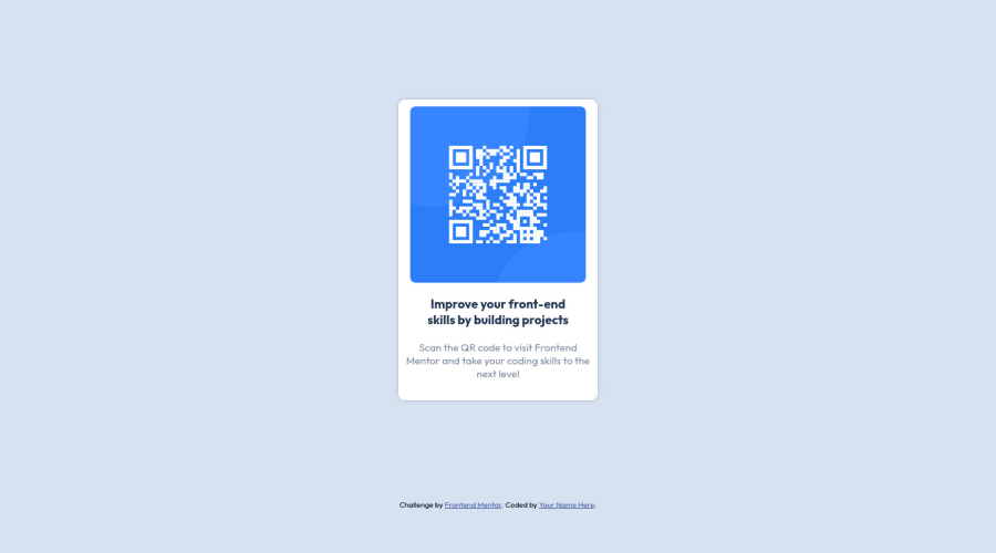
Design comparison
Solution retrospective
I would like to ask how to improved with the management of spaces, using paddings or margins?
also the use of media querys and until which point these are useful ?
also, what are the best practices to work with css, flexbox and media querys?
Community feedback
- @ErayBarslanPosted about 2 years ago
Hey there, congrats on your first solution! Some suggestions:
- It's good to get use to media-query. But using it too much might have side effects on responsiveness, taking the smooth transition away. Also card becomes way too big on wider screens since it's always relative to body. For this challenge you can use
max-widthwithout the need of media-query. - You don't need container div. You can center your card relative to body. By removing all styling on media-query and .container you can use:
body {
    min-height: 100vh;
    display: flex;
    justify-content: center;
    align-items: center;
}

.child{
    ...
    width: 95%;
    max-width: 300px;
}

.attribution {
     ...
     position: absolute;
     bottom: 0;
}
/* position absolute on attribution perfectly centers the container */
Test it out and you'll see the difference. Also as far as html goes, you can use semantic landmarks instead using div on everything. By removing the container your html inside body can look like:
  <main class="child">
    <img src="./images/image-qr-code.png" alt="image-qr-code">
    <br>
    <div class="text">
      <h1 class="mob"> Improve your front-end <br> skills by building projects </h1>
      <br>
      <p>Scan the QR code to visit Frontend Mentor and take your coding skills to the next level</p>
    </div>
    <br>
  </main>

  <footer class="attribution">
    Challenge by <a href="https://www.frontendmentor.io?ref=challenge" target="_blank" rel="noopener noreferrer">Frontend Mentor</a>.
/* when you link to other pages, adding rel attribute adds security */
    Coded by <a href="#">Your Name Here</a>.
  </footer>
I haven't touch <br> but for spacing it's better to use margin through css instead br. Hopefully these helps, happy coding :)
Marked as helpful1 - It's good to get use to media-query. But using it too much might have side effects on responsiveness, taking the smooth transition away. Also card becomes way too big on wider screens since it's always relative to body. For this challenge you can use
- @SindhujaBandaruPosted about 2 years ago
Hey EDDuardOo-Code!Congrats on completing your Project.It looks Great. We use margins most to improve spaces between paragraphs,sections.We use paddings to improve elements content or inside of elements to define borders.Media queries are used for different devices,tablets,laptops,desktops etc. With Media queries we can built responsive websites.You can practice css in frontendmentor itself.On time goes by you will get it . Checkout w3schools for more https://www.w3schools.com/css/css_margin.asp
Marked as helpful1
Please log in to post a comment
Log in with GitHubJoin our Discord community
Join thousands of Frontend Mentor community members taking the challenges, sharing resources, helping each other, and chatting about all things front-end!
Join our Discord
