Design comparison
SolutionDesign
Solution retrospective
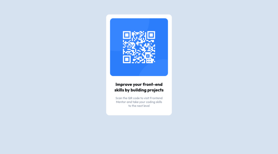
- It was very difficult for me to know what values to use by just looking at an image. I think using a Figma file would have sped up my process tenfold.
- I wasn't sure how to approach the desktop version of this first challenge. To me, they looked identical and the .md file did not specify an increase in font size or scale.
- I would like some initial feedback on my code structure or overall design accuracy. Looking for areas that I need to improve on for my next challenge.
Community feedback
Please log in to post a comment
Log in with GitHubJoin our Discord community
Join thousands of Frontend Mentor community members taking the challenges, sharing resources, helping each other, and chatting about all things front-end!
Join our Discord
